

OSEASponsored
Esc
How OSEA turns a body moisturizer comparison into a quiz ad
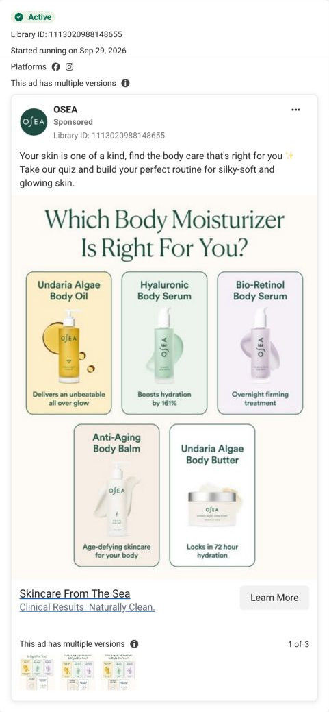
A static Meta ad asking Which Body Moisturizer Is Right For You? Five OSEA products sit in colored tiles with one claim each, from glow on the body oil to 72-hour hydration on the body butter. The copy invites people to take the quiz, and the link opens it.
OSEA
3 creatives lead here1 / 3
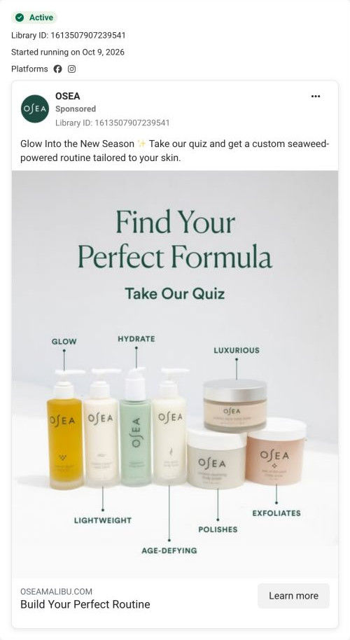
Find Your Body Care Routine
Initial quiz step only. No quiz answers or contact details were submitted.
Find your routine through a quiz
The creative invites a personalized recommendation and sends visitors to the quiz entry rather than a product detail page. Compare the creative with the destination and explore the other ads sharing this route.
- Brand
- OSEA
- Observed offer
- Body-care routine quiz
- Creative angle
- Personalization
- Page type
- Quiz entry
- Ad format
- Image
- Listed start date
- Sep 29, 2026
- Captured
- Oct 19, 2026
- Library ID
- 1113020988148655
- Destination
- oseamalibu.com
Selected for its design and offer structure. Ad performance isn’t available in this collection.
What this ad does well
The headline is a question the shopper already has, which is a strong start. The tiles answer it partway by giving each product one job, and the color coding makes the comparison easy to scan. The tagline "Clinical Results. Naturally Clean." adds a trust angle, and the specific claims on the tiles (a 161% hydration boost on the serum, 72-hour hydration on the butter, as the ad states them) are more concrete than most beauty ads manage. OSEA ran several versions of this ad from September 29, 2026.
What's missing
The ad asks about body moisturizers, but the quiz it opens starts by asking whether you want a face, body or both routine, so the shopper repeats a choice the ad already made. The tiles also carry percentage and hour claims with no source in the ad. Send this ad to the body branch of the quiz, or to a page comparing the five moisturizers, and add a short footnote for where the numbers come from, as the product pages do with their study notes.
Beat by beat
- HeadlineOn-image text asks Which Body Moisturizer Is Right For You?
It opens on a real shopping question, which pulls in people already comparing options.
- ImageFive colored tiles show each product with one claim: glow, a hydration boost, overnight firming, age-defying care and 72-hour hydration.
Giving each product one job makes the range easy to compare.
- CopyYour skin is one of a kind; take the quiz and build your routine for silky-soft, glowing skin.
It positions the quiz as the tiebreaker for the choice the image sets up.
- HeadlineThe link card reads Skincare From The Sea and Clinical Results. Naturally Clean.
It adds the brand's sea-sourced and clean positioning as a trust cue.
Where it sends people
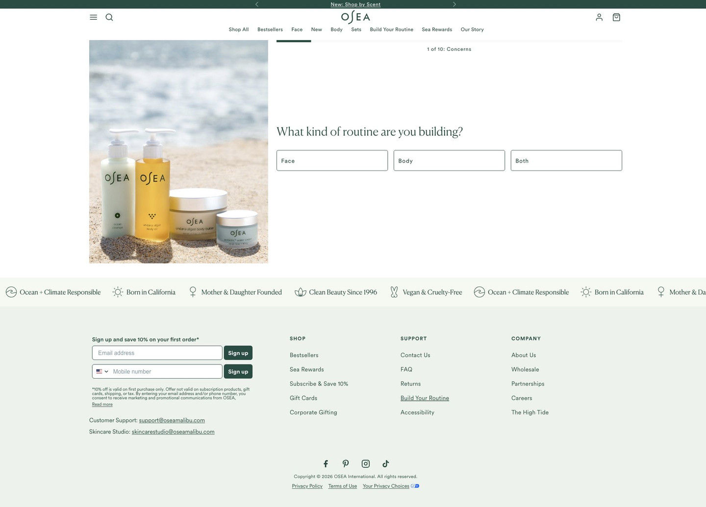
The ad links to the quiz, which the persona's ladder often ranks as the best destination for a choice like this. The quiz opens on its first question with a progress bar, so it feels short. But that first question asks face, body or both, which undoes the body-only framing the ad worked to set up. The capture shows only that first step, so we couldn't see which moisturizer the quiz recommends at the end.
The page it sends people to: How OSEA's routine quiz opens straight on the first question
OSEA's routine quiz page, captured at its first step: a lifestyle photo beside a progress bar and one question about what kind of routine you're building, with face, body and both as answers, followed by a values ticker and footer. Three OSEA ads in the Fluid library send people here, all personalization ads inviting viewers to take the quiz.
How the page is built
- 01Announcement bar
A rotating line links to a new shop-by-scent feature, a secondary path for people not ready for the quiz.
- 02Header
Menu, search, logo, account, bag and a nav row that includes build-your-routine and rewards links keep the full site one tap away.
- 03Quiz step
A lifestyle photo beside a progress bar, a serif question about your routine and three answer buttons (face, body, both) start the quiz with almost no effort.
- 04Values ticker
Scrolling icons for climate responsibility, origin, founders, clean beauty and vegan answer whether the brand shares the shopper's values.
- 05Footer
Email and SMS sign-up with a first-order discount, support emails and links catch people who leave the quiz.
The first fixes we would make
- The first screen doesn't say what you get for finishing. Add one line above the question ("Get your routine in under a minute" plus any offer) so the reward is visible from the start.
- Two of the ads are body-specific, but the quiz asks face, body or both every time. Pass a parameter from those ads to skip to the body branch so shoppers don't repeat a choice.
Read the full breakdown of this page
Three hooks you could test
- Lead with the uncomfortable problem. “Lotion gone by lunch? You might be using the wrong one.”
- Sell the outcome. “Find the body moisturizer that still feels like it's working tomorrow.”
- Call out the habit you're replacing. “Stop grabbing whatever lotion is on sale. Match it to your skin.”
What to borrow for your brand
- Open with the comparison question your shopper is already asking, and lay out the options with one job each.
- Color-code a product comparison so it can be scanned in a second.
- Deep-link a category-specific ad into the matching branch of your quiz so shoppers don't answer the same question twice.
One of 8 OSEA ads in the Fluid Inspiration Library, captured from the Meta Ad Library on Oct 19, 2026. We record that an ad ran publicly, not how it performed.