How MUDWTR frames a coffee swap around family mornings
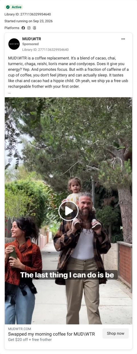
A brand-page video of a family on a leafy sidewalk, a father carrying a toddler on his shoulders beside his partner, captioned “The last thing I can do is be.” The headline reads Swapped my morning coffee for MUDWTR, with $20 off and a free frother, and it links to the classic Rise page.

A browser shopping-extension badge appears in the upper-right margin of this capture.

The familiar coffee-swap route
The ad describes replacing morning coffee and links to the classic Rise campaign page. Compare the creative with the destination and explore the other ads sharing this route.
- Brand
- MUDWTR
- Observed offer
- Advertised $20 off + free frother
- Creative angle
- Habit switch
- Page type
- Dedicated offer
- Ad format
- Video
- Listed start date
- Sep 23, 2026
- Captured
- Oct 19, 2026
- Library ID
- 2771136329954640
- Destination
- mudwtr.com
Selected for its design and offer structure. Ad performance isn’t available in this collection.
What this ad does well
This ad speaks to a different buyer from most of the set: a parent who needs energy for a family day, not a creator talking about mushrooms. The caption reads like the start of a personal reason (the last thing he can be is presumably tired or on edge), and the headline is written in the first person, which makes it feel like a testimonial. Giving each audience its own hook and setting is how a brand reaches buyers beyond its core fans.
What's missing
The caption is cut mid-sentence and the copy doesn't finish the thought, so the parent's reason never lands for muted viewers. If you make one like this, put the full line in the overlay or the copy (what a parent can't afford to be in the morning) and connect it to the claimed benefit in their words, keeping any sleep or energy claims attributed.
Beat by beat
- 0-3sA father with a toddler on his shoulders walks beside his partner, captioned at the start of a personal reason.
It speaks to parents and sets up a reason viewers want to hear.
- CopyThe text lists the ingredients, says the drink gives energy and promotes focus with a fraction of coffee's caffeine so you don't feel jittery and can sleep, and jokes about the taste.
It explains the swap in a casual voice.
- HeadlineThe link card reads Swapped my morning coffee for MUDWTR, with $20 off and a free frother.
It frames the offer as a first-person testimonial.
The offer
$20 off plus a free frother in the headline, and a free USB rechargeable frother in the copy.
Where it sends people
It sends people to the classic Rise campaign page, an older-style page with a full header (menu, account and cart), and one of 3 ads in the Fluid library that land there. An announcement bar offers a free Pumpkin Spice Latte bag with a starter kit, and the hero headline, Energy & focus without the jitters, sits over an ingredient list, a “Try It – Save $20” button and a 30-day money-back guarantee. The $20 saving in the ad matches the button, so the promise carries through. The weak spots are the menu, account and cart links (easy exits from a campaign page) and the ingredient bands below the explainer, which looked like unloaded images in our capture. A founder image near the bottom adds a human face, but nothing on the page speaks to parents the way this ad does.
The page it sends people to: How MUDWTR's classic Rise page explains a coffee swap
MUDWTR's classic Rise campaign page, an older-style layout with the full store header. A jitter-free-swap hero with a $20 savings button leads into a what-is-it explainer, one band per ingredient, an FAQ and starter-kit tiles. It's the destination for 3 ads in the Fluid library, all habit-switch ads offering $20 off and a free frother.
How the page is built
- 01Announcement bar
A bright band offers a free Pumpkin Spice Latte bag with an Original or Coffee Starter Kit, giving a seasonal reason to buy now.
- 02Header
A menu toggle, centered logo, account and cart give the full store navigation.
- 03Hero
A hand holding the tin sits beside the jitter-free headline, a playful description, an ingredient list, the $20 button, a guarantee and two perks, with a star rating and creator quote below, answering what it is, what it costs and whether others like it.
- 04Explainer
What-is-it copy, how-to-drink instructions, a nutrition facts table, the full ingredient list and certification badges answer what you're switching to and how to make it.
- 05Ingredient bands
Full-width bands give each ingredient a name and a short paragraph on why it's included, answering what each one does.
- 06FAQ
An Ask us anything accordion opens on caffeine content and covers sugar, sourcing, pregnancy, samples, wholesale and certification.
- 07Starter kits
Colored flavor tiles with caffeine-level labels lead to a shop-all link with struck-through and sale price and the kit contents, restating the offer.
- 08Best sellers carousel
Product cards with struck-through and sale prices show the wider range.
- 09Founder image
A large founder photo with no copy adds a face to the brand.
- 10Newsletter and footer
A newsletter headline, link columns, research citations, a disclaimer and a slogan ticker close the page.
The first fixes we would make
- The full store header (menu, account, cart) gives ad visitors easy exits that MUDWTR's newer campaign pages remove. Use a logo-only header here too, so the $20 offer is the only path forward.
- The ingredient bands looked like unloaded gray backgrounds in our capture, which leaves a long stretch of the page without images. Check that those background images load on mobile, or replace them with inline photos that can't fail silently.
Read the full breakdown of this page
Three hooks you could test
- Sell the outcome. “Enough energy for the school run and the rest of the day, without the crash.”
- Show a specific moment of use. “Saturday morning, kid on my shoulders, and the only cup I needed.”
- Call out the habit you're replacing. “I used to need three coffees to keep up with my toddler.”
What to borrow for your brand
- Make an ad for a buyer outside your usual creator audience (parents, commuters) with a setting they recognize.
- Write the link headline in the first person so the offer reads like a testimonial.
- Finish the caption's thought in the copy so a personal reason lands without sound.
One of 34 MUDWTR ads in the Fluid Inspiration Library, captured from the Meta Ad Library on Oct 19, 2026. We record that an ad ran publicly, not how it performed.