How MUDWTR uses Cory Sandhagen's podcast reaction as an ad
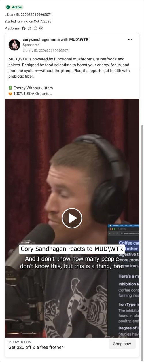
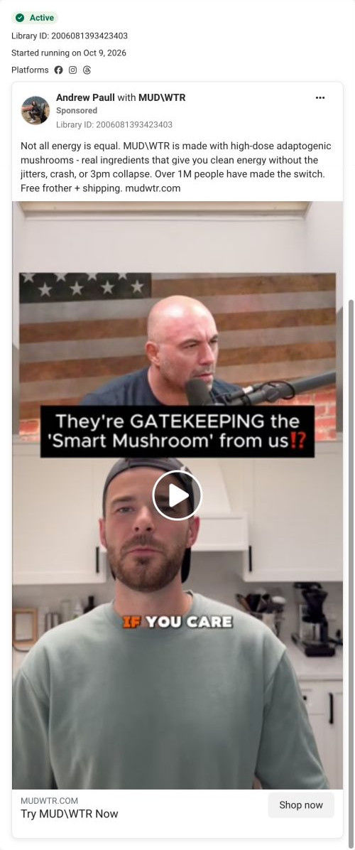
A partnership video posted with corysandhagenmma: Cory Sandhagen in headphones at a podcast mic, captioned “Cory Sandhagen reacts to MUDWTR,” with an on-screen article about coffee in the background. The copy lists MUDWTR's claimed benefits and free frother and shipping, the headline offers $20 off and a free frother, and it links to the Rise 2 campaign page.

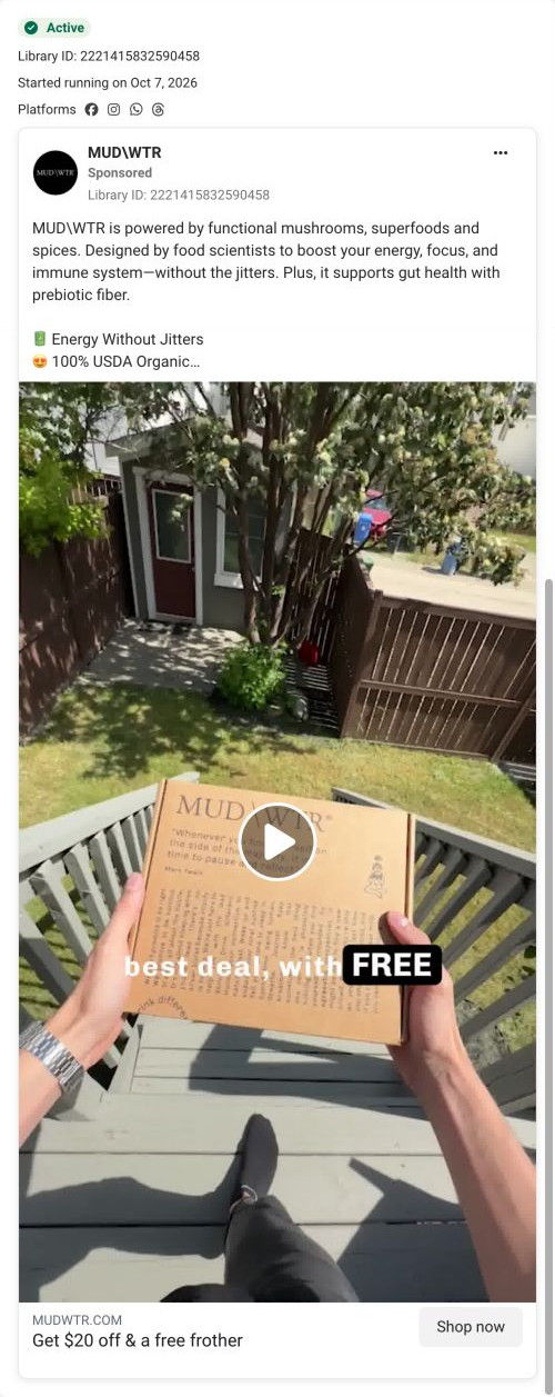
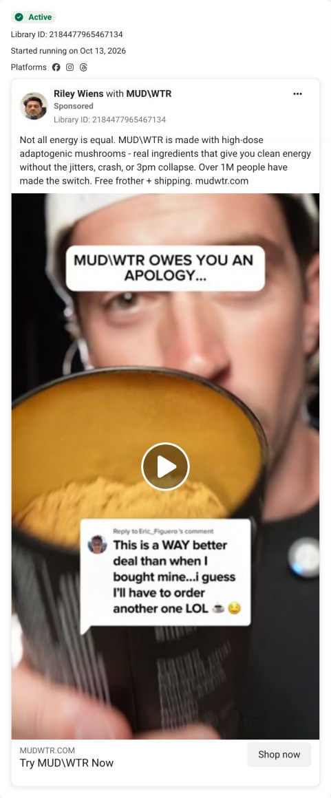
A browser shopping-extension badge appears in the upper-right margin of this capture.

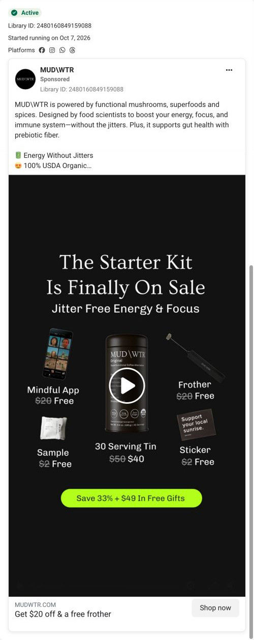
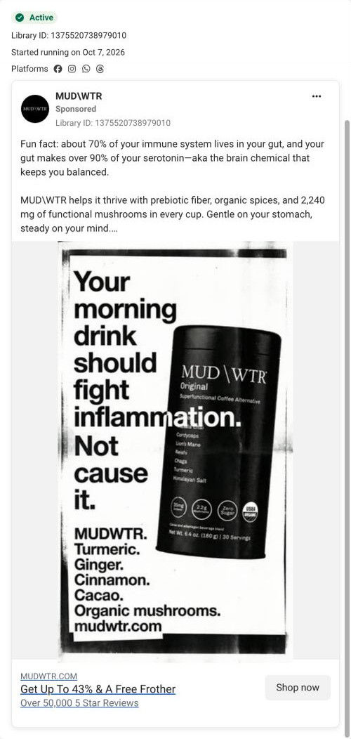
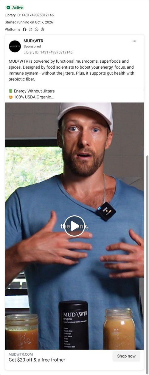
Get $20 off & a free frother
The copy introduces the mushroom blend and its advertised benefits, while the CTA makes the $20 saving and free frother explicit. The CTA leads to the Rise 2 starter-offer route, shared by several ads in this collection. Compare the creative with the destination and explore the other ads sharing this route.
- Brand
- MUDWTR
- Observed offer
- Advertised $20 off + free frother; free shipping in the copy
- Creative angle
- Habit switch
- Page type
- Dedicated offer
- Ad format
- Video
- Listed start date
- Oct 7, 2026
- Captured
- Oct 19, 2026
- Library ID
- 2206326156965071
- Destination
- mudwtr.com
Selected for its design and offer structure. Ad performance isn’t available in this collection.
What this ad does well
A recognizable athlete reacting on his own podcast feels like overheard opinion rather than a script, and the caption names him so viewers who don't know his face still get the endorsement. The live captions (he says plenty of people don't know this is a thing) make it watchable on mute. The copy then turns the reaction into a scannable list with emoji bullets for energy without jitters, USDA Organic and 2,240mg of mushrooms per serving, which gives the skimmer something concrete.
What's missing
The reaction is the proof, but the ad never says what Cory is reacting to. The background screen points at coffee and something to do with iron, yet the copy goes to a generic benefits list, so the most interesting idea in the frame is left unexplained. If you get a reaction clip like this, write the copy around the specific thing the athlete said, attribute it to him, and keep the claims about the product itself carefully worded and sourced.
Beat by beat
- 0-3sCory Sandhagen sits at a podcast mic in headphones with a caption naming him and live subtitles, and an article about coffee is visible on a screen beside him.
It establishes who's talking and makes the endorsement feel unscripted.
- CopyThe text says food scientists designed MUDWTR to boost energy, focus and the immune system without jitters and claims prebiotic fiber supports gut health, followed by emoji bullets and free frother and shipping.
It turns a loose reaction into a list of claimed benefits a skimmer can take in.
- HeadlineThe link card offers $20 off and a free frother.
It puts a specific dollar figure on the click.
The offer
The headline offers $20 off and a free frother, and the copy adds free shipping.
Where it sends people
It sends people to the Rise 2 campaign page, a long, focused landing page with a logo-only header, and one of 10 ads in the Fluid library that land there. The hero names the category (Super Functional Coffee Alternative) with a “Try it & Save 43%” button, a 30-day money-back guarantee line and four icon benefits framed as coffee without its drawbacks. That button and guarantee repeat after the product block, the comparison table and the review section, so every proof block ends in the same action. Here's the snag: the ad promises $20 off and a free frother, and the page's first offer is 43% off plus a mystery gift. Both deals may be real, but a visitor has to reconcile two numbers before trusting either, so send the $20-off versions to a page that leads with $20 (the classic Rise page does) or rewrite the ad around 43%.
The page it sends people to: How MUDWTR's Rise 2 page ends every proof block with the same offer
MUDWTR's Rise 2 campaign page, a dark, long-form landing page with a logo-only header. It names the coffee-alternative category up top and repeats one 43% savings button with a guarantee line after each proof block. It's the destination for 10 ads in the Fluid library, mostly habit-switch videos and statics with a couple of creator cuts.
How the page is built
- 01Logo-only header
A black header with only the logo removes navigation so ad visitors stay on the offer.
- 02Hero
An overhead cup photo sits beside a rating with review and member counts, a category headline, the savings button, a guarantee and four benefit bullets, answering what this is and what it costs to try.
- 03Testimonial band and ticker
A creator quote with avatar and a scrolling strip of benefit words add an early human voice.
- 04Product block
A pack shot with ingredients sits next to a morning-ritual headline, flavor and feeling columns, a checklist of attributes and certifications, and the button again, answering what's in it and how it tastes.
- 05Founder video
An Our Founding Story card with a one-line origin and a Play button answers who's behind the brand.
- 06Comparison table
The product column is raised and outlined against two rival products with star ratings and four attribute rows, then the button, answering why this one over other blends.
- 07Creator carousel
A Loved By Creative Minds carousel pairs a large quote with portraits, answering who else drinks it.
- 08Customer proof
A Join The Movement headline, topic tabs filtering review cards, a carousel of UGC video thumbnails and the button again answer whether people like it.
- 09Ingredients grid
Eight cards with texture photos, benefit tags and one sentence each explain what every ingredient is there for.
- 10Product range
A Popular Products grid with status tags (new, popular, zero caffeine) shows the wider line.
- 11FAQ
A long accordion covers caffeine, sugar, sourcing, pregnancy, preparation and taste, answering the remaining objections.
- 12Brand story, retail and footer
Founding story, a partner-app perk and giving rows lead into retailer logos, a humorous ad video, journal cards, social photos, press logos, a newsletter and footer citations and disclaimer.
The first fixes we would make
- Several ads that land here offer $20 off and a free frother, and the button says 43%. Rewrite those ads around 43% or route them to the classic Rise page, which leads with $20, so the number never changes between the ad and the page.
- The free frother and the mystery gift that some ads promise don't appear in the hero. Add a short line under the button listing what comes free, so the offer from the ad is confirmed on arrival.
Read the full breakdown of this page
Three hooks you could test
- Sell the outcome. “A pro athlete explains what he drinks on training days, and it isn't coffee.”
- Lead with the uncomfortable problem. “Most people don't know their morning cup does this. He didn't either.”
- Show a specific moment of use. “What he makes before a 6am session, in his own words.”
What to borrow for your brand
- Ask creators with their own podcast or show to react to your product on air, then cut the clip with their name in the caption.
- Write the ad copy around the specific thing your endorser said, so the reaction and the claim reinforce each other.
- Use emoji bullets for three or four concrete product facts so mobile skimmers get the substance in a glance.
One of 34 MUDWTR ads in the Fluid Inspiration Library, captured from the Meta Ad Library on Oct 19, 2026. We record that an ad ran publicly, not how it performed.