

Magic Spoon CerealSponsored
Esc
How Magic Spoon used a curious headline to sell protein treats
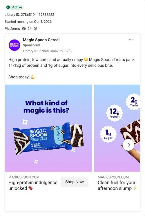
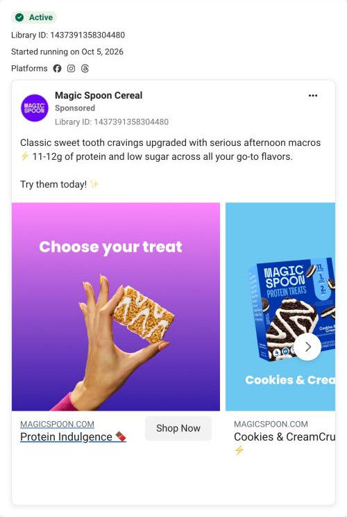
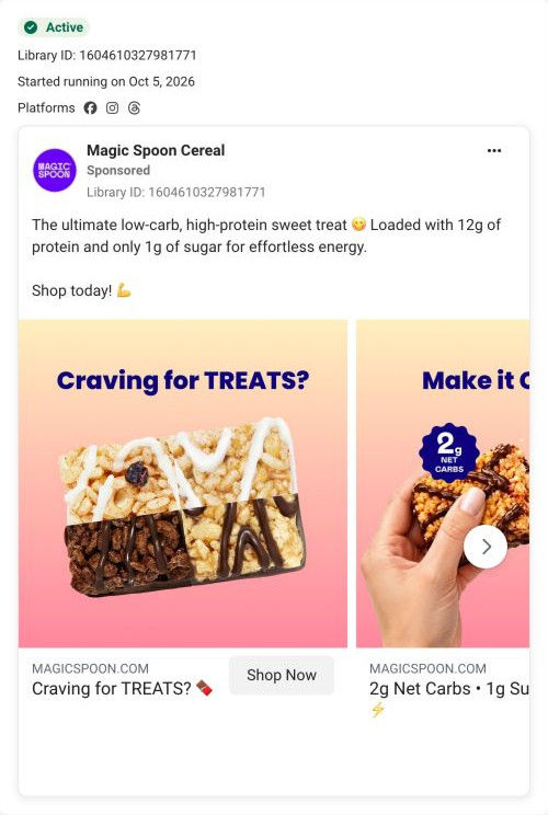
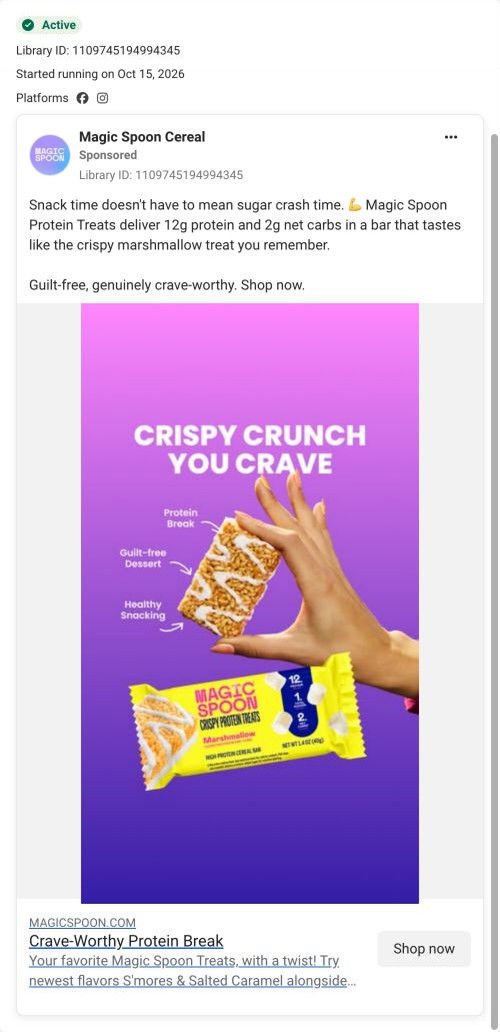
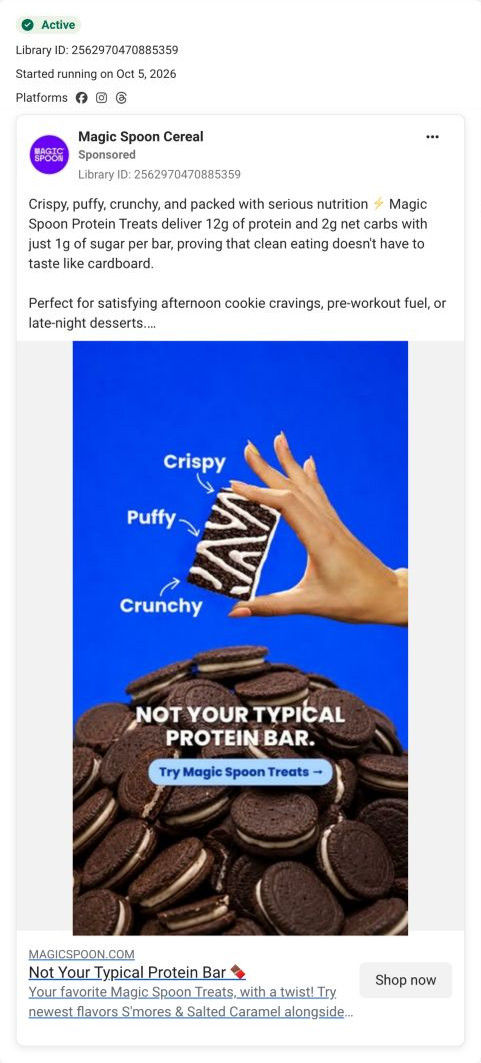
A Magic Spoon carousel for its Protein Treats. The first card shows a Cookies & Cream bar under “What kind of magic is this?” and the next circles a bar with protein, sugar and carb callouts. The copy claims the treats are high protein, low carb and actually crispy. It links to the treats variety pack page.
Magic Spoon
8 creatives lead here1 / 8

Cereal Treats variety pack
High-protein indulgence unlocked
The ad positions the crispy treat as a high-protein alternative to a familiar sweet snack. The CTA routes to the Protein Treats variety-pack page, shared by several different snack messages in the collection. Compare the creative with the destination and explore the other ads sharing this route.
- Brand
- Magic Spoon
- Observed offer
- Protein Treats Variety 6
- Creative angle
- Product benefits
- Page type
- Product page
- Ad format
- Image
- Listed start date
- Oct 5, 2026
- Captured
- Oct 19, 2026
- Library ID
- 27865104479838282
- Destination
- magicspoon.com
Selected for its design and offer structure. Ad performance isn’t available in this collection.
What this ad does well
The headline plays on the brand name and asks the question a skeptic would ask, which makes the nutrition card that follows feel like the answer. The second card is the strongest piece: three round callouts (protein, sugar, carbs) pointing at the bar, so the claims sit right on the product. The copy's “actually crispy” is a small, smart line because it answers the doubt most people have about protein snacks (that they taste like chalk) before they raise it.
What's missing
The opening card shows the wrapper and bar but no one eating it, so the magic is claimed rather than shown. The afternoon-slump caption on the second card is the most relatable idea in the ad, and it's tucked under a card most people won't swipe to. If you make one like this, lead with the afternoon slump on the first card and save the playful brand line for the second, so the ad opens on a moment the viewer recognizes.
Beat by beat
- ImageA Cookies & Cream wrapper and bar on a blue-to-lilac gradient under “What kind of magic is this?”
A curious question plays on the brand name and makes the viewer want the answer.
- ImageThe next card shows a bar with 12g protein, 1g sugar and 2g carbs callouts.
Claims placed around the product answer the question visually.
- CopyHigh protein, low carb and actually crispy, with a claim of 11-12g of protein and 1g of sugar.
“Actually crispy” answers the taste doubt protein snacks usually face.
Where it sends people
The ad lands on the Cereal Treats variety pack product page. The page's claims grid, with six short nutrition claims around a bar close-up, is almost the same device as the ad's second card, so the click feels consistent. The story band with a three-word texture headline picks up the crispy point, and the customer video carousel gives the taste proof the ad doesn't. It's a product page, so the afternoon-slump framing is not carried through.
The page it sends people to: How Magic Spoon built its Protein Treats variety pack page
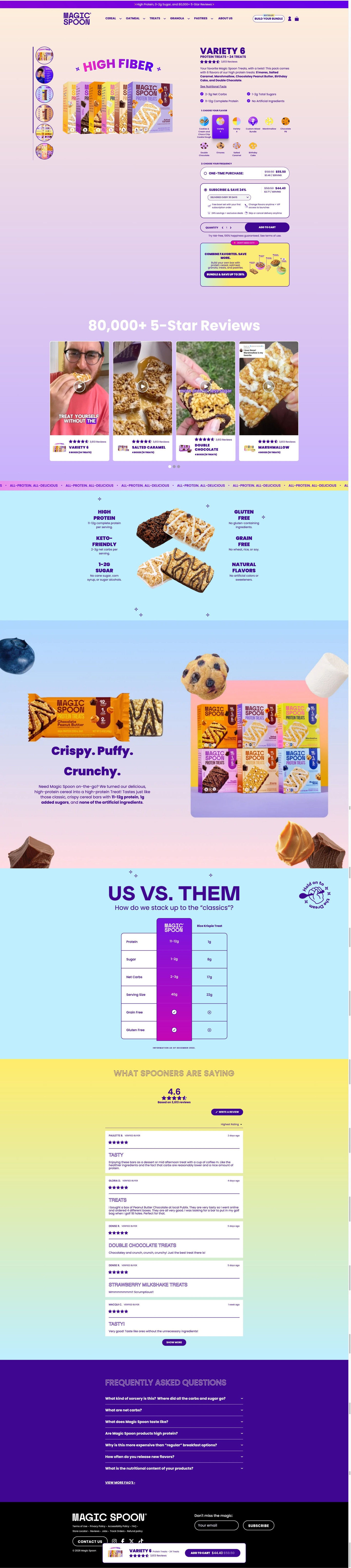
Magic Spoon's product page for its Cereal Treats variety pack. A two-step buy box (choose flavor, choose frequency, with subscription pre-selected) leads into customer videos, a nutrition claims grid, an us-vs-them table, reviews and FAQ. Eight ads in the Fluid library send people here, mostly product-benefit statics plus creator taste tests and use-occasion ads.
How the page is built
- 01Announcement bar and header
A purple line with headline benefits and the review count, plus a Build your bundle pill, set the brand's main claims and ways to shop.
- 02Buy box
A fan of boxes under a curved claim headline beside the name, pack size, rating, flavor list and four check bullets answers what it is.
- 03Flavor and frequency steps
A numbered flavor grid and a pre-selected subscribe card with perks, then Add to cart and a guarantee line, answer which one and how often.
- 04Bundle upsell
A “Don't miss out” card for a mixed build-your-own box offers a bigger order.
- 05Video reviews
A review-count headline and four customer video cards tagged by flavor answer whether it actually tastes good.
- 06Claims grid
Six short nutrition claims around a bar close-up answer what's in it.
- 07Story band
A three-word texture headline, short paragraph and product lineup with ingredient photos answer what it's like to eat.
- 08Us vs. them
A table against a classic treat with nutrition and check-or-x rows answers why switch.
- 09Reviews
An average rating, sorting and verified review cards answer whether buyers are happy.
- 10FAQ
Seven questions, including a price objection, handle the last doubts.
- 11Footer and sticky bar
A floating bar with rating and sale price keeps Add to cart in reach on the scroll.
The first fixes we would make
- Several ads that land here sell a specific moment (the afternoon slump, on the go, the sugar crash), but the page speaks only in general claims. Add a short use-moment row near the claims grid, like afternoon, on the go and after dinner, so those visitors see their reason on the page.
- The creator taste tests mention finding the treats in a store, and the page doesn't say where else to buy. A small where-to-buy line near the buy box would catch shoppers who prefer to pick them up.
Read the full breakdown of this page
Three hooks you could test
- Lead with the uncomfortable problem. “Every protein bar you've tried tastes like chalk. This one doesn't.”
- Show a specific moment of use. “The 3pm slump snack that doesn't end in a nap.”
- Turn the benefit into a picture people get in a second. “Three numbers circled around one bar. That's the whole pitch.”
What to borrow for your brand
- Place your nutrition or spec callouts directly around the product photo so the claim and the product are one image.
- Use a playful headline that asks the skeptic's question, then answer it on the next card.
- Address the biggest doubt about your category (taste, texture) in a two-word phrase in the copy.
One of 20 Magic Spoon ads in the Fluid Inspiration Library, captured from the Meta Ad Library on Oct 19, 2026. We record that an ad ran publicly, not how it performed.