How Lemme's Reset page turns a GLP-1 claim into an explainer
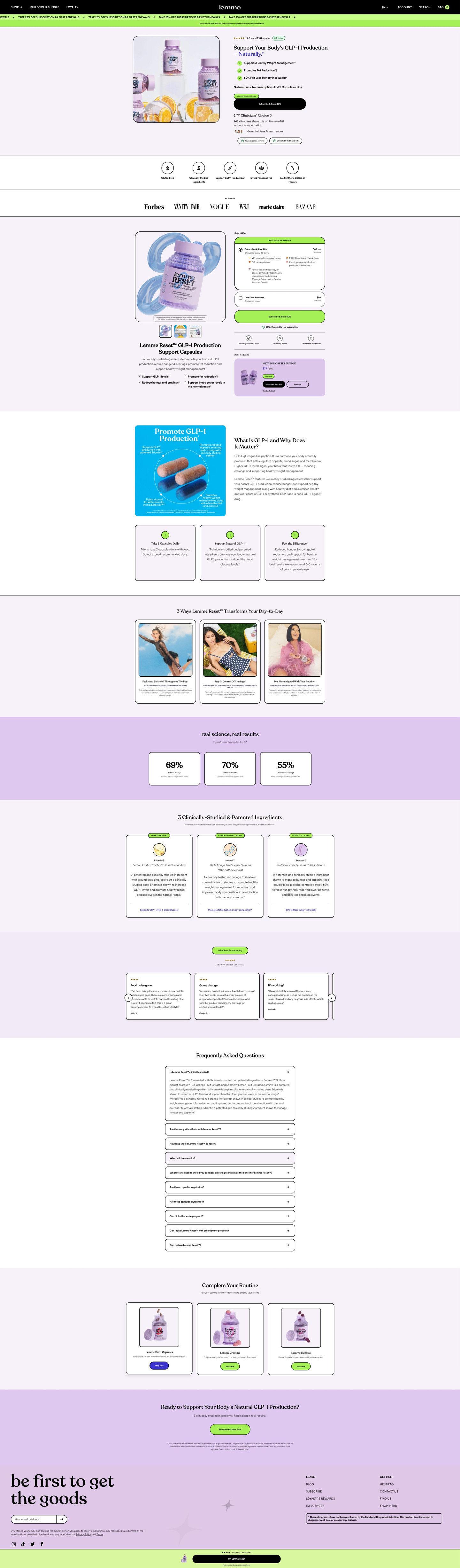
Lemme's landing page for Reset, its capsule supplement marketed around GLP-1. It's a long product lander with a hero CTA and full offer selector up top, then a GLP-1 explainer, use-case cards, a results band, ingredient cards, reviews and FAQ. 2 Lemme ads in the library send people here, both Halloween statics about cravings.

Captured while scrolling the public page. The page reflects the offer visible on October 20, 2026; it may differ from the original ad.
Lemme · Reset capsules
Lemme's landing page for Reset, its capsule supplement marketed around GLP-1. It's a long product lander with a hero CTA and full offer selector up top, then a GLP-1 explainer, use-case cards, a results band, ingredient cards, reviews and FAQ. 2 Lemme ads in the library send people here, both Halloween statics about cravings.
- Brand
- Lemme
- Page type
- Product landing
- Ads leading here
- 2
- Captured
- Oct 20, 2026
- Destination
- lemmelive.com
Selected for its design and offer structure. Ad performance isn’t available in this collection.
What this page does well
The page gives buyers two chances to purchase before any education, then explains the claim the ads lead with. A subscribe button sits in the hero and a full offer selector with a pre-selected subscription and a bundle card follows right after the press logos. The explainer that comes next asks what the mechanism is and why it matters, defining GLP-1 with an annotated infographic and step cards (how to take it, how it works, what to expect). The clinicians' choice laurel and magazine logo bar sit high on the page, which backs a bold product claim early, and a sticky bar keeps the purchase in reach through the long education sequence.
How the page is built
- 01Announcement ticker
A scrolling subscription-discount line and a note that it applies at checkout, answering whether there's a deal.
- 02Header and hero
Shop, bundle and loyalty links, then product bottles with citrus beside a verified rating, a headline with an italic accent word, check claims, a percent-off tag over a CTA and a clinicians' choice laurel, answering what Reset is and why to trust it.
- 03Attribute strip and press bar
Line icons with short labels and an As seen in row of magazine logos, answering diet fit and outside credibility.
- 04Buy box
A framed product photo with benefit checks beside a pre-selected subscription card, a one-time card, an auto-applied note, trust icons and a Make it a bundle card, answering how to buy and what you save.
- 05Mechanism explainer
An annotated infographic, a headline asking what the mechanism is and why it matters, and step cards, answering what GLP-1 is and how the brand says Reset relates to it.
- 06Use-case cards
A headline about ways it changes your day with photo cards, answering what daily life with the product looks like.
- 07Results band
A headline and stat cards on lavender, answering what results the brand reports.
- 08Ingredients
Outlined cards with an ingredient name, extract detail, paragraph and a stat line, answering what's inside and what research the brand cites.
- 09Reviews
A star rating with count and a carousel of text review cards, answering whether other buyers liked it.
- 10FAQ
Outlined accordions with the first open, answering remaining questions.
- 11Cross-sell and closing band
“Complete your routine” cards, then a question headline with a CTA and disclaimer, offering more products and a last prompt.
- 12Footer and sticky bar
A newsletter signup, links, a boxed disclaimer and a sticky bar with thumbnail, rating and CTA, keeping the purchase in reach.
What's missing, in the order we'd fix it
- The results band shows stat cards, but a weight-related claim needs its source right beside the number. Add who ran each study, how many people took part and over what period, next to each stat.
- The Halloween cravings angle from both ads disappears on the page. Add a seasonal subline or hero image that mentions cravings, so a visitor from the candy-bucket or pumpkin ad sees the same idea first.
- The education sequence is long, and the use-case cards come after the GLP-1 explainer. Move the use cases up beside the hero, so a reader sees what daily life with the product looks like before the science.
How the ads set it up
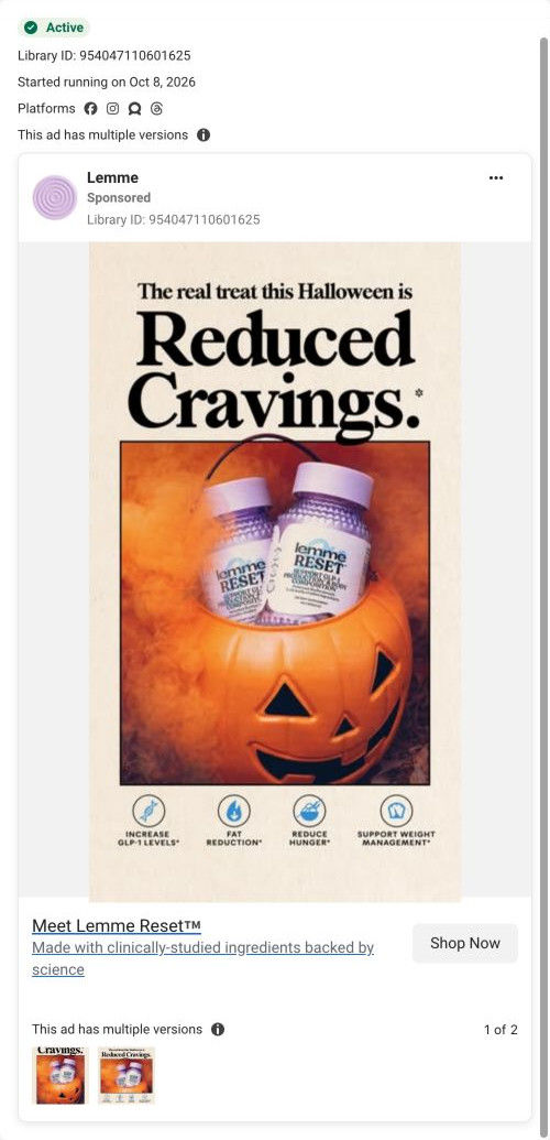
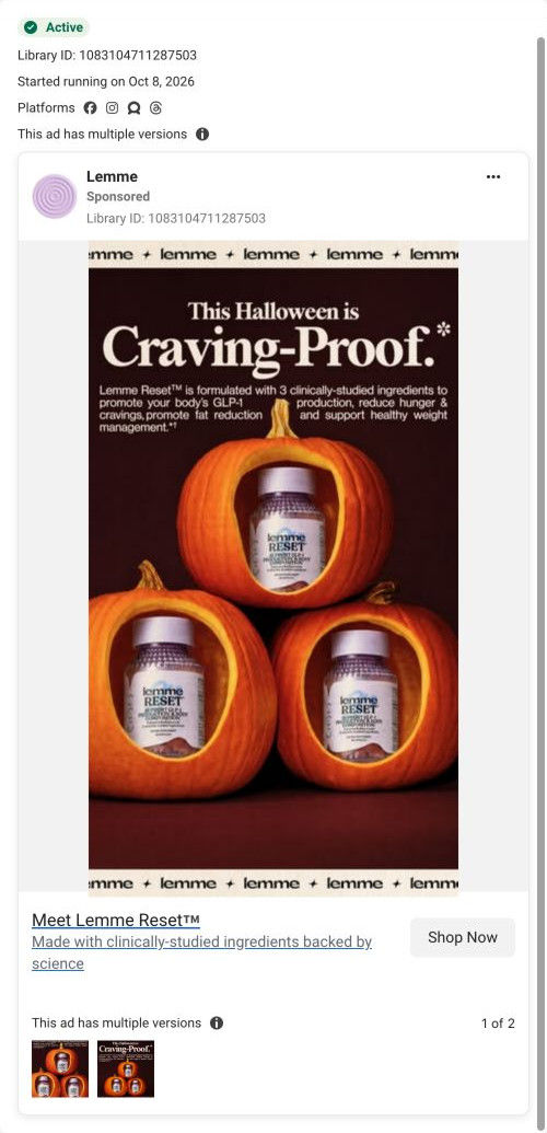
Both Lemme ads that land here use Halloween to frame cravings, one with bottles in a candy bucket and four claim icons, the other with bottles in carved pumpkins and a paragraph about GLP-1. The page doesn't repeat the season, but it does pay off the GLP-1 claim in depth with a dedicated explainer right after the buy box. That's a good fit for the pumpkin ad, which already introduces the mechanism, and a bigger jump for the candy-bucket ad, which only shows icons.
What to borrow for your brand
- Place a “what is it and why it matters” explainer right after the buy box, so the term your ads use gets defined before you ask for trust.
- Put a clinicians' endorsement and press logos high on the page when the product makes a bold claim, so credibility arrives early.
- Keep a sticky bottom bar with rating and CTA on long education pages, so readers can buy without scrolling back up.
Ads that send people here
- How Lemme Reset uses Halloween candy season to frame cravings
- How Lemme Reset frames Halloween as craving-proof
Captured from lemmelive.com in October 2026 for the Fluid Inspiration Library. Offers and prices change; this is what the page showed when we captured it.