What this ad does well
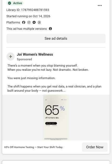
The creative is about as plain as a static gets, and that’s on purpose: one huge “65%” and the words “off hormone labs” are readable even at thumbnail size. The copy does the emotional work. Its opening reframes fatigue as a lack of information rather than a personal failing (“You were just missing information”), which is a kind thing to say to someone who’s been told they’re fine. The second half anchors the price against “a $400 functional workup” and lists three inclusions with checkmarks, so a reader who expands the caption gets the reason the discount matters.
What's missing
The image gives a scroller nothing to recognize except a discount: no person, no symptom and no product. A 65% discount on something you didn’t know you needed rarely stops a thumb. If you make one like this, put the problem above the number (something like “Exhausted and told you’re fine?”) or show a slice of the results report, so the offer lands on someone who already sees herself in it. The copy also runs two separate blocks back to back; trimming it to one would get the checklist above the fold.
Beat by beat
- Image
An oversized “65%” with “off hormone labs” and a small button on a pale background.It makes the discount the only thing to read, so the offer survives even a half-second glance.
- Copy
The caption opens with “There’s a moment when you stop blaming yourself” and calls the problem missing information.It reframes tiredness as something to measure, which gives the reader permission to look for an answer.
- Copy
A later block anchors against “a $400 functional workup” and lists real biomarkers, real medical review and real clarity.It puts a price comparison and three inclusions in front of anyone who expands the caption.
- Headline
The link headline reads 65% Off Hormone Testing with “Start Your Shift Today.”It repeats the offer under the image and adds a light push to start now.
The offer
65% off hormone labs, framed against “a $400 functional workup” in the copy. The creative shows the percentage but no dollar price.
Where it sends people
The ad goes to Joi’s dedicated lab-testing landing page, a better rung than a store product page because the whole page is about testing. The hero carries the same “65% off for new customers” badge, a lab selector and a 30-60 minute clinician consultation, so the promise carries straight through. The catch is the order: the hero leads with “Analyze up to 110 biomarkers,” which is the top panel, while the cheapest option (the 56-biomarker Complete Hormone Lab Panel at $52.15) only shows up in the Select A Lab section further down. Putting that starting price in the hero would match what a discount-led ad sets up.
The page it sends people to: How Joi’s women’s lab landing page sells three hormone panels
Joi’s dedicated women’s lab-testing landing page leads with “Analyze up to 110 biomarkers” and a 65% new-customer badge, then walks through what Joi offers, a three-step process, three panels with prices and reviews. 2 ads in the Fluid library send people here: a minimalist 65% off static and a creator explaining that testing is easier than ordering takeout.
How the page is built
- 01
Lab-testing hero and lab selectorIt states up to 110 biomarkers, shows the 65% new-customer badge and offers a lab dropdown, answering “what is this and is there a deal?”
- 02
Press logosVogue, Vice, Poosh, Men’s Health, Medium and goop answer “has anyone heard of this company?”
- 03
What Joi offersA short list (menopause-trained clinicians, nutrition support, Rx management, messaging, multi-lab discounts) answers “what do I get beyond a blood test?”
- 04
How it worksThree steps (lab test, clinician consultation, start treatment) with “No insurance required” answer “what’s the process?”
- 05
Customer quoteNikki Zahka’s testimonial answers “has this worked for anyone?”
- 06
Select A LabThree panels with badges, biomarker counts, clinician time and prices ($52.15, $139.65, $244.65) answer “which one should I buy?”
- 07
Reviews carouselShort quotes under “Real people, real results” add more voices to the proof.
- 08
FAQQuestions about preparation, cycle timing, results, insurance and HSA/FSA answer the logistics.
- 09
Email captureAn email field catches visitors who aren’t ready to buy.
The first fixes we would make
- The hero leads with the 110-biomarker panel, but the cheapest panel (56 biomarkers at $52.15) is what the discount ads are really selling, and its price only appears far down. Put a “starting at $52” line and the Complete panel in the hero, so discount-led traffic sees its price immediately.
- The page never shows the results report or what the clinician plan looks like, even though the creator ads talk about both. Add a screenshot of a real report and a sample plan between How it works and Select A Lab.
Read the full breakdown of this page
Three hooks you could test
- Lead with the uncomfortable problem. “Told your labs are normal but you still don’t feel like yourself?”
- Call out the habit you're replacing. “Before you buy another bottle of supplements, find out what your body is actually short on.”
- Sell the outcome. “Walk into your next appointment knowing exactly which numbers are off.”
What to borrow for your brand
- Make the discount the single largest element on a static, then let the caption carry the story for people who stop.
- Anchor your price against the expensive alternative your buyer already knows about, like a $400 workup, instead of only against your own list price.
- Use a three-item checkmark list in the caption to spell out what the discounted price includes.
One of 18 Joi + Blokes ads in the Fluid Inspiration Library, captured from the Meta Ad Library on Oct 22, 2026. We record that an ad ran publicly, not how it performed.