How Labs by Hims sells blood testing with one results chart
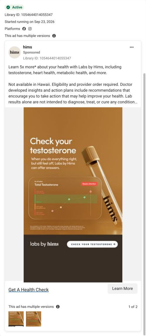
A static Labs by Hims image ad with the headline “Check your testosterone” over a results chart and a sample tube. The copy claims you'll learn five times more about your health than routine bloodwork, covering testosterone, heart and metabolic health. The ad sends people to the Labs by Hims service page, which opens on a much broader testing headline.

Captured while scrolling the public page. Opening prompts are shown without answering health questions. A browser shopping-extension badge may appear in the right margin.

Get A Health Check
An advertised five-times-more comparison positions the lab service around several health categories. The recorded CTA points to the Labs by Hims URL. Compare the creative with the destination and explore the other ads sharing this route.
- Brand
- Hims
- Observed offer
- Labs by Hims; eligibility and provider order required
- Creative angle
- Education
- Page type
- Service landing
- Ad format
- Image
- Listed start date
- Sep 23, 2026
- Captured
- Oct 20, 2026
- Library ID
- 1054644014055347
- Destination
- hims.com
Selected for its design and offer structure. Ad performance isn’t available in this collection.
What this ad does well
The chart is the best part: it shows a total testosterone reading with a needs-attention tag, which is what the viewer would actually see in the app. The subhead names a feeling a lot of men recognize, doing everything right and still feeling off, and turns it into a reason to test. The copy's five-times-more comparison is footnoted with what routine bloodwork usually covers, so the claim is scoped. It's a calm, credible ad for a category that often overpromises.
What's missing
The ad is about testosterone, but the page it lands on leads with signals for many health conditions, so the viewer who tapped for a T check starts somewhere broader than the ad promised. That jump is the biggest thing to fix. If you make one like this, send it to a testosterone-specific entry, or make the page's hero mirror the ad's headline and chart. The ad also shows no price or reason to act now, and a cost cue (even per day) would answer the first question most viewers have.
Beat by beat
- ImageA sample tube beside a chart card showing a total testosterone reading flagged for attention.
It shows the actual output of the service, so the viewer pictures their own result.
- Headline“Check your testosterone” with a subhead about feeling off even when you do everything right.
It connects a vague feeling to one concrete action.
- CopyA five-times-more claim against routine bloodwork, the categories covered, and eligibility notes.
It widens the value beyond testosterone and scopes the comparison in a footnote.
Where it sends people
The ad goes to the Labs by Hims service page, a long product-style page rather than a focused landing page or quiz. It opens on a headline about testing for signals of health conditions, then a stat strip, three how-it-works cards with app mockups, category tiles of what's tested and a wall of condition names. Further down, a comparison table against routine labwork pays off the ad's five-times-more claim well. The testosterone hook, though, is one tile among many, so the page answers what's included before it answers the viewer's original question.
The page it sends people to: How the Labs by Hims page explains a blood-testing membership
The Labs by Hims service page, a long product-style page for a lab-testing membership. It opens on a broad headline about testing for signals of many health conditions, then covers how it works, what's tested, the action plan, a labwork comparison, experts and FAQs. One ad in the Fluid library sends people here, an education static about checking testosterone.
How the page is built
- 01Header
Anchor links to what's tested, how it works, the action plan and screening let visitors jump to their question.
- 02Hero
A warm photo with a floating data card and a broad headline about health signals answers what the service is for.
- 03Stat strip
Three short facts (markers tested, test frequency, per-day cost) answer how much and how often.
- 04How it works
Three numbered cards with app mockups answer what the process looks like.
- 05What's tested
Eight category tiles with sample markers answer what the test covers.
- 06Conditions wall
Large condition names and an out-of-range phone overlay answer why early indicators matter, as the page frames it.
- 07Action plan
Check bullets and a recommendation card answer what I get after results.
- 08Comparison table
Checks versus dashes against routine labwork answer why pay for this instead.
- 09Add-on screening
A dark panel with covered types and feature tiles answers what else I can add.
- 10Experts
A carousel of doctor cards answers who is behind the guidance.
- 11Platform bento
Tiles with a customer-count stat, plans and provider follow-ups answer what the membership includes overall.
- 12FAQ and closing band
Six accordions and a final Start testing band answer eligibility, insurance and in-person questions, then ask once more.
The first fixes we would make
- The ad that lands here is about testosterone, but the hero speaks to many conditions at once. Add a testosterone-specific hero variant, or send that ad to a page that leads with the testosterone chart it showed.
- The page is long, and the price only appears as a per-day figure in the stat strip. Put the full membership price near the comparison table, where visitors are weighing value.
Read the full breakdown of this page
Three hooks you could test
- Lead with the uncomfortable problem. “Doing everything right and still feeling off?”
- Turn the benefit into a picture people get in a second. “This is what your results screen looks like.”
- Call out the habit you're replacing. “Your yearly checkup only looks at part of the picture.”
What to borrow for your brand
- Show the actual results screen your customer will see, with one reading flagged, as the hero image.
- Scope any comparison claim in a footnote that says exactly what you're comparing against.
- Turn a vague feeling the customer already has into one concrete first action in the subhead.
One of 25 Hims ads in the Fluid Inspiration Library, captured from the Meta Ad Library on Oct 20, 2026. We record that an ad ran publicly, not how it performed.