How Hers hands an ad click straight to a one-question goal quiz
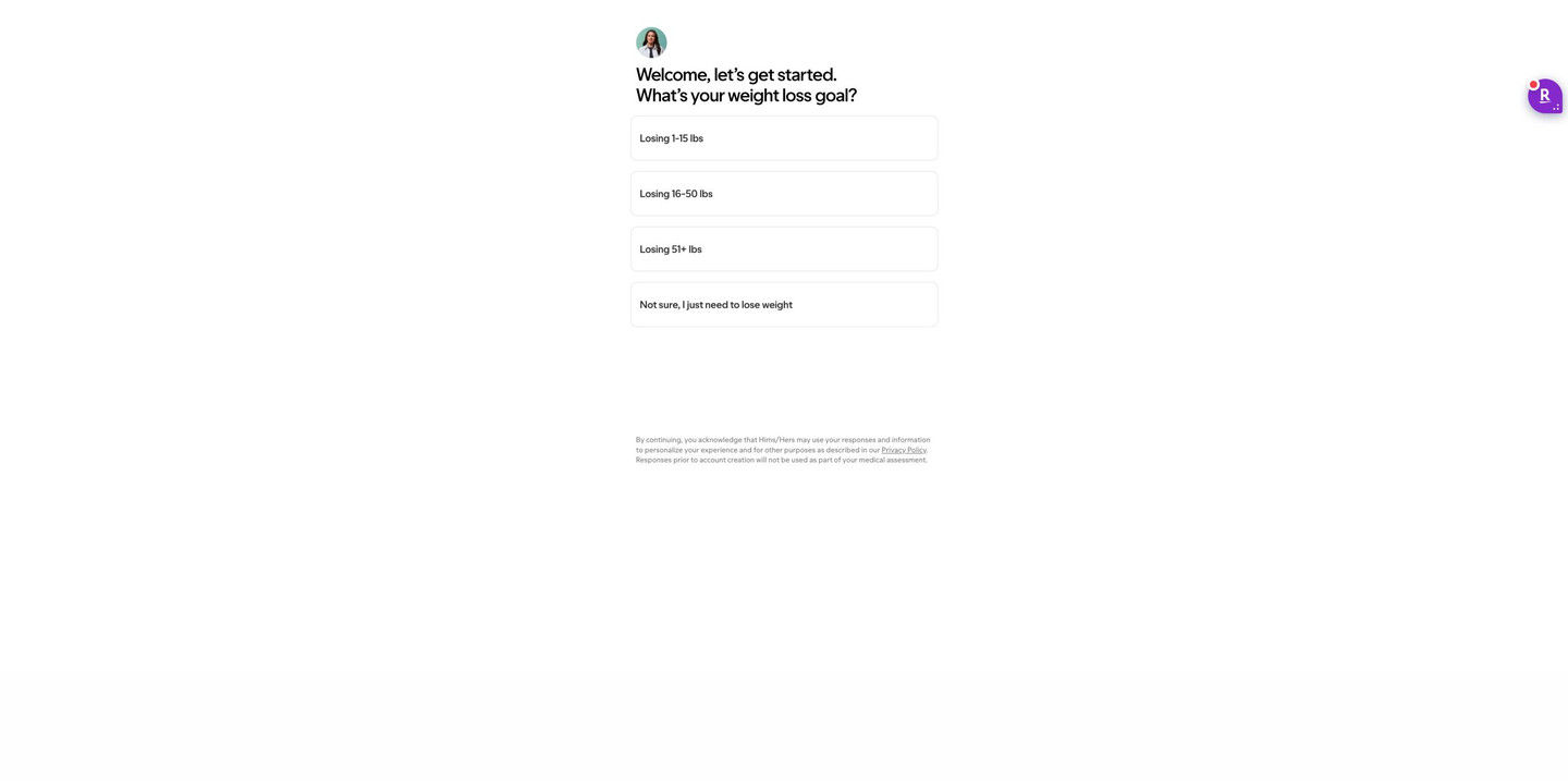
This Hers page is the opening screen of its weight-loss goal quiz: a small avatar, a greeting and one goal question with four stacked answers, including a not-sure option, above a short consent note. There's no hero or navigation. 1 ad in the Fluid library sends people here, a product-choice static about a range of GLP-1 treatments.

Captured while scrolling the public page. Opening prompts are shown without answering health questions. A browser shopping-extension badge may appear in the right margin.
Hers · Weight-loss goal quiz
This Hers page is the opening screen of its weight-loss goal quiz: a small avatar, a greeting and one goal question with four stacked answers, including a not-sure option, above a short consent note. There's no hero or navigation. 1 ad in the Fluid library sends people here, a product-choice static about a range of GLP-1 treatments.
- Brand
- Hers
- Page type
- Quiz entry
- Ads leading here
- 1
- Captured
- Oct 20, 2026
- Destination
- forhers.com
Selected for its design and offer structure. Ad performance isn’t available in this collection.
What this page does well
Hers skips the landing page entirely: the click from the ad opens on one tappable question, so the funnel starts the moment the page loads. The answers are three goal ranges plus a "not sure" option, which keeps undecided visitors in the flow instead of making them guess. A single tap moves forward with no Next button, and the consent language sits as small print under the answers (continuing means agreeing to how responses are used, with a privacy policy link), so it adds no extra step. The small round avatar above the greeting makes the screen read like the start of a conversation rather than a form.
How the page is built
- 01Minimal screen
A narrow centered column on white with no navigation or footer keeps the visitor's attention on one question.
- 02Avatar and greeting
A small avatar of a person and a bold two-line greeting with the goal question make the quiz feel personal from the first line.
- 03Answer list
Four full-width outlined buttons (three goal ranges and a not-sure option) answer "what do I do here?" with one tap and no Next button.
- 04Consent note
Small print under the answers explains how responses are used and links the privacy policy, answering "what happens to what I share?"
What's missing, in the order we'd fix it
- The ad promises access to a range of GLP-1 treatments, and nothing on this screen mentions treatments. Add one line under the greeting that connects the goal question to the promise (your answers shape which treatment options you see at the end), so the visitor knows why they're being asked.
- There's no progress indicator or sense of how long the quiz is. A small step count at the top would set expectations for a visitor who just arrived from an ad and doesn't know what they've started.
- With no header or brand cues beyond the avatar, a first-time visitor has little to tell them who's asking. Add the logo and a short line saying licensed providers review the answers, so the screen carries some trust before someone shares health goals.
How the ads set it up
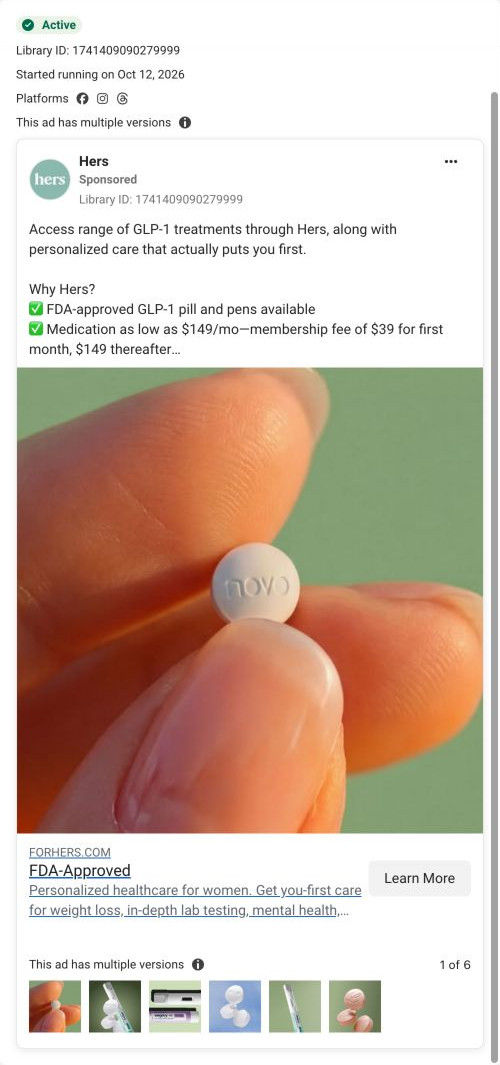
The single ad captured here is a product-choice static with the headline "Access a range of GLP-1 treatments". The page doesn't restate that promise; it goes straight to a question about the visitor's goal. That's a fast handoff (the click starts the funnel immediately), but it relies on the visitor trusting that the range of treatments is waiting at the end, because the first screen never mentions it.
What to borrow for your brand
- Send a high-intent ad straight to the first quiz question with no hero or navigation, so the click turns into an answer before the visitor has time to reconsider.
- Include a "not sure" answer alongside your specific ranges, so undecided people keep going instead of leaving because none of the options fit.
- Put a small human avatar above your first question, so the quiz reads as a conversation with a person rather than a form to fill in.
Ads that send people here
Captured from forhers.com in October 2026 for the Fluid Inspiration Library. Offers and prices change; this is what the page showed when we captured it.