What this ad does well
The opening frame is one most parents recognize instantly: mom in the pool, a kid in each arm, clearly mid-summer chaos. It sets up her problem without a word of health talk, because the viewer already understands why staying healthy has been hard. Her caption calls Hers "a working mama's dream", which ties the service to a specific person rather than a generic benefit. The script stacks the practical reasons she cares about (online, a doctor-led plan, staying within budget) in the order a busy parent would weigh them.
What's missing
After the strong first frame, the script turns into a list of features read to camera, and none of them is shown. There's no proof, no price despite her saying it fits a budget, and no clear moment where Hers fits into her day. If you make one like this, keep the kids in it: show her answering intake questions on her phone poolside or during nap time, then name the actual first-month cost so the budget point means something. That keeps the visual promise and the spoken one about the same life.
Beat by beat
- 0-3s
She's in a pool, smiling, holding her two young sons.The scene tells viewers who she is and why her time is short before she speaks.
- 3-12s
She says she's partnering with Hers and that staying healthy has been tough working from home with both kids all summer.It names a problem parents feel and gives the disclosure up front.
- 12-26s
She lists a 100% online process, a prescription and treatment plan with a doctor, and staying within budget.Stacking practical benefits answers the busy parent's questions about time and cost.
- 26-34s
She mentions FDA-approved options and affordable membership and invites viewers to see if it's a fit.A soft close suits a viewer who's curious but not ready to commit.
The offer
She calls the membership affordable and says it fits a budget but names no price in the video.
Where it sends people
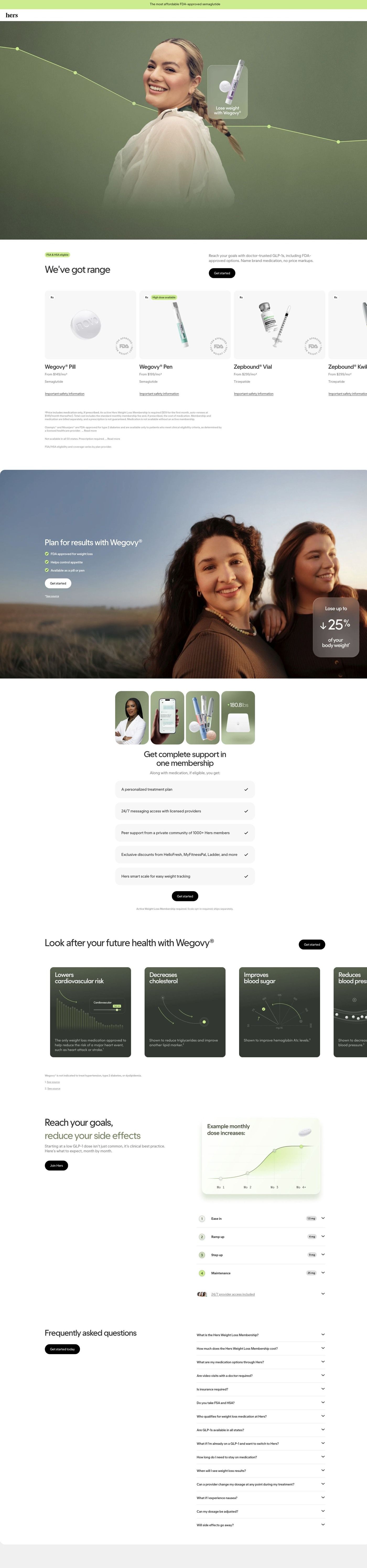
People land on Hers's Wegovy consultation entry page, a focused landing page that starts the intake in the hero instead of a homepage. For a busy parent, that first one-tap question is exactly the low-effort start her script promises. Her budget point gets picked up further down, where the options carousel shows a "from" monthly price per medication and the membership section lists what the fee includes. The page's results band shows two women outdoors, which is close to her sunny, outdoor feel, though nothing on the page speaks to moms specifically; a line about fitting care around family life would carry her angle through.
The page it sends people to: How Hers starts its Wegovy consultation inside the page hero
Hers's Wegovy consultation page opens with the first intake question in a card over the hero, then scrolls through medication cards with "from" monthly prices, a results band, membership perks, a dosing schedule and a long FAQ. 53 ads in the Fluid library send people here, including price-led, food-noise, membership-value and creator-story ads.
How the page is built
- 01
Announcement bar and headerA single line on affordability sits above a logo-only header, so the price question gets a nod before anything else and there's no navigation to wander off into.
- 02
Hero with intake cardA full-bleed portrait with a descending line-graph overlay frames a centered card that asks whether the visitor already has a treatment in mind, answering "where do I start?" with three one-tap choices.
- 03
Options carouselHorizontal medication cards show the product, prescription and availability tags, a "from" monthly price and a safety link, answering "what are my options and what do they cost?" with pricing and eligibility fine print below.
- 04
Results bandAn outdoor photo of two women carries a headline, three check items and a frosted card with a large outcome figure, which is the page's main answer to "what could this look like for me?"
- 05
MembershipA four-photo collage (provider, app, product, smart scale) sits over five check-row perks, answering "what am I paying the membership for?"
- 06
Health-marker carouselDark cards pair data-visualization illustrations with short benefit claims and footnotes, covering what the page says treatment can involve beyond the scale.
- 07
Dosing scheduleA chart of example monthly dose increases and a numbered four-step accordion with dose pills explain how treatment eases in, answering "what happens month to month?"
- 08
FAQA long accordion covers membership, cost, options, visits, insurance, HSA, eligibility, switching and side effects, catching the practical objections that are left.
- 09
FooterDisclaimers, an app-download card with a QR code, a pharmacy certification badge and a sister-brand card close the page with trust signals and legal detail.
The first fixes we would make
- The membership fee is separate from the medication price, and that detail lives in fine print under the carousel. Put the combined monthly cost (medication plus membership) right under each "from" price, so a visitor who came from a price ad sees the number they'll actually pay before they start the intake.
- Creator-story ads send people here, but the page has no member stories or reviews to pick up that voice; the results band shows a single outcome figure instead. Add a short strip of member stories (with the same disclaimers Hers uses elsewhere) near the results band, so someone who clicked a creator's documentary finds people like that creator on the page.
Read the full breakdown of this page
Three hooks you could test
- Show a specific moment of use. “I did my whole consultation from a pool chair while the kids had swim lessons.”
- Lead with the uncomfortable problem. “Two kids home all summer and zero time for yourself? Same.”
- Sell the outcome. “Feel like yourself again without adding one more appointment to your week.”
What to borrow for your brand
- Open on a frame that shows your customer's busiest moment (kids, work, travel), so the problem is clear before anyone speaks.
- Have the creator name the type of customer out loud in the caption (a working mom, a new grad), so the right viewers self-select.
- When a creator says the product is affordable, put the real starting price on screen at that moment so the claim lands.
Transcript
I'm partnering with hers today as a busy mom working from home with both kids all summer, staying healthy has been tough, which is why I'm excited to share their weight loss program options for others looking for a jump start. With 100% online process, getting access to a prescription and treatment plan with a doctor, all while staying within budget and helping you meet your goals. Hers is a great solution. With FDA proof treatment options, affordable membership and all able to be completed online, that's what you call convenient, check out hers today and see if it's a great fit for your journey.
Text on screen
- Prescription products
- Eligibility rules apoly
- consultation.
- Prescription products require online consultation.
- Eligibility rutes apply. See website for details
- Eligibility rules apply. See website for details.
One of 125 Hers ads in the Fluid Inspiration Library, captured from the Meta Ad Library on Oct 22, 2026. We record that an ad ran publicly, not how it performed.