
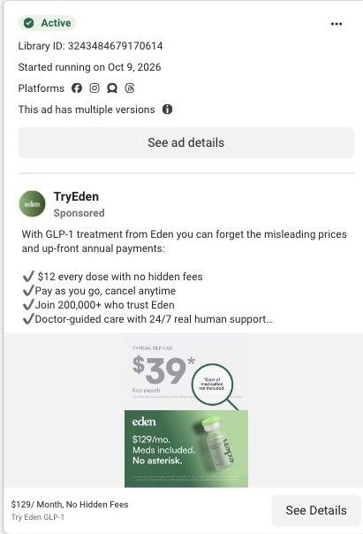
areliwellness with TryEdenSponsored
Esc
How Eden's two-column table compares GLP-1 pricing plans
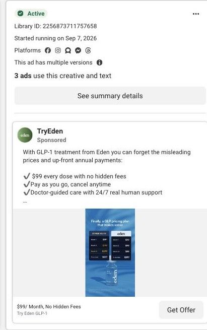
A static Eden ad on Meta from Sep 7, 2026. A blue card promises a GLP pricing plan that makes sense, with two dark tables: Other guys, where the monthly price changes, and Eden, at $99 each month, each ending in a total. A vial sits below. The copy repeats $99 every dose and links to Eden's GLP-1 landing page.
Eden
16 creatives lead here1 / 16


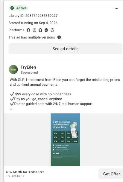

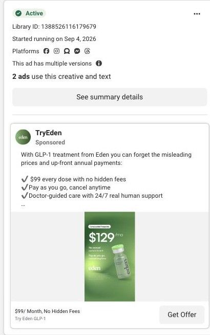
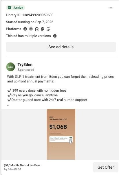

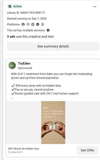
GLP-1 care · affiliate campaign destination
Native Meta creative and exact outbound link observed October 22, 2026. Redirects were followed to the captured public destination. Actual GLP-1 acquisition creative; peptide/sermorelin keyword searches showed no matches. Advertiser claims are source material; activity does not establish performance. No personal, health or payment details were entered.

$99/ Month, No Hidden Fees
A long care page develops a direct offer through product quality, treatment comparisons, care steps, customer stories and assessment entry. Compare the creative with the destination and explore the other ads sharing this route.
- Brand
- Eden
- Observed offer
- $99/ Month, No Hidden Fees
- Creative angle
- Price / offer layout
- Page type
- Service landing
- Ad format
- Image
- Listed start date
- Sep 7, 2026
- Captured
- Oct 22, 2026
- Library ID
- 2256873711757658
- Destination
- eden.health
Selected for its design and offer structure. Ad performance isn’t available in this collection.
What this ad does well
A side-by-side table is the most direct way to show a pricing difference, and this one keeps the comparison honest-looking by showing month-by-month rows and a total for each side. Calling the competitor the other guys keeps it general, so anyone paying for GLP-1 elsewhere can map their own plan onto the left column. Eden's column is visually lighter, with its logo in a white header, so the eye lands on it. Eden ran several versions of this creative from September 7, 2026.
What's missing
At feed size the numbers are tiny, and the totals, which are the whole argument, are no bigger than the monthly rows. A shopper scrolling past sees two dark boxes and a vial, not a saving. Make the two totals the largest numbers on the card (or print the difference as its own line) and cut the rows to what's needed. The ad also gives no reason to switch now; the page's lifetime price guarantee would turn a cheaper total into one that stays cheaper.
Beat by beat
- HeadlineWhite type over a blue background promises a GLP pricing plan that finally makes sense.
It speaks to people who already find GLP-1 pricing confusing, which is a problem they recognize.
- ImageTwo tables side by side: Other guys, with prices that change by month, and Eden, at $99 every month, each with a total.
It lets the viewer compare plans the way they'd compare quotes, row by row.
- CopyCheckmarks for $99 every dose, pay as you go and doctor-guided care, plus the compounded-medication disclaimer.
It restates the flat price and adds the care promise the table doesn't cover.
The offer
$99 every month, framed against an unnamed competitor plan whose monthly price changes, with pay as you go and cancel anytime.
Where it sends people
The ad lands on Eden's GLP-1 affiliate page, a focused landing page. The hero repeats the flat-price idea with monthly pricing at every dose for both medications, and the treatment comparison section further down gives the visitor more comparison to read. The page doesn't repeat this ad's provider-versus-provider table near the top, so the specific argument that got the click (their total versus ours) has to be remembered rather than re-seen. Putting a version of the table right under the hero would close that gap.
The page it sends people to: How Eden's GLP-1 landing page turns a price ad into an assessment
Eden's GLP-1 affiliate page is a long, focused landing page that opens on semaglutide at $99/mo and tirzepatide at $129/mo with a free assessment, then covers quality, treatment, care steps, stories and FAQs. All 16 Eden ads in the Fluid library link here, mostly price comparisons plus creator and doctor videos.
How the page is built
- 01Care offer hero
The headline, three benefits, both monthly prices and the free assessment button answer what it costs and how to start, with Trustpilot and member-count proof alongside.
- 02Quality and clinical oversight
It covers where the medication comes from and who oversees care, answering whether a low price means cutting corners.
- 03Problem and treatment explanation
It explains the problem and how the treatment is meant to work, answering why someone would consider it at all.
- 04Treatment comparison
It compares treatment options so the visitor can work out which one fits before starting the assessment.
- 05Care process
It walks through the steps from assessment to ongoing care, answering what happens after the click.
- 06Customer stories
It shows stories from customers, answering whether people like the visitor have used the service.
- 07Plan inclusions and assessment entry
It lists what the plan includes and repeats the assessment entry, answering what the monthly price covers right before asking again.
- 08FAQs and safety information
It handles remaining questions and the safety and compounding disclosures, answering the last objections before signing up.
The first fixes we would make
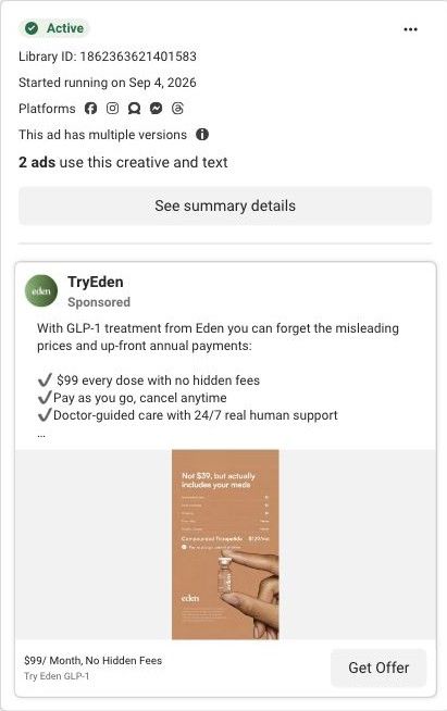
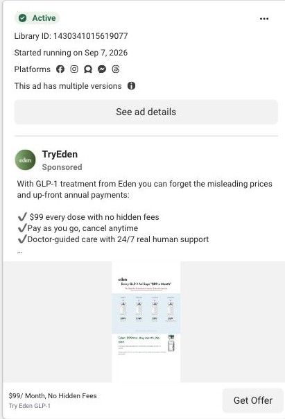
- Most of the ads that link here argue against other providers' pricing (teaser prices, annual prepay, prices that rise with the dose), but the captured sections don't repeat that receipt or other-guys table near the top. Put a compact version of the comparison right under the hero so the argument that earned the click is still on screen.
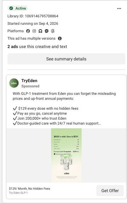
- Most ad headlines say $99, yet some of the creatives themselves show $129, and the hero lists both without saying which one a visitor is likely to get. Add one line under the two prices explaining that the assessment determines the medication, so the $99 expectation doesn't turn into a surprise.
Read the full breakdown of this page
Three hooks you could test
- Call out the habit you're replacing. “Your current plan charges more every month. Ours doesn't.”
- Turn the benefit into a picture people get in a second. “Their three-month total. Our three-month total.”
- Sell the outcome. “A plan you can explain to your partner in one sentence.”
What to borrow for your brand
- Compare your pricing with a generic competitor in two columns of month-by-month rows, so viewers can map their own plan onto the left side.
- Make the totals, not the rows, the largest numbers on a comparison card, since the total is the argument.
- Repeat the comparison table near the top of the landing page so the reason someone clicked is still in front of them.
One of 16 Eden ads in the Fluid Inspiration Library, captured from the Meta Ad Library on Oct 22, 2026. We record that an ad ran publicly, not how it performed.