
Drdent.coSponsored
Esc
How Dr.Dent sells a daily mouthwash habit with a three-step diagram
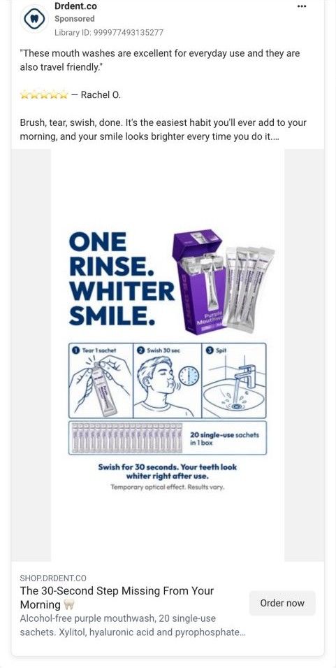
A static image ad headlined "One Rinse. Whiter Smile." with a tear, swish, spit diagram for Dr.Dent Purple Mouthwash, on Meta from Oct 8, 2026. The copy opens on a five-star quote from Rachel O., pitches a 30-second morning habit, and offers Subscribe & Save 20% or a 3-Pack. It links to the Purple Mouthwash product page.
Dr Dent
5 creatives lead here1 / 5
Purple Mouthwash
Creative, ad copy, and CTA link captured directly from Meta Ad Library on October 21, 2026. The linked destination was visited.
The 30-Second Step Missing From Your Morning 🦷
Compare the creative’s objection or demonstration with the product offer, supply options, bundles, customer proof, and FAQs on the destination. Compare the creative with the destination and explore the other ads sharing this route.
- Brand
- Dr Dent
- Observed offer
- The 30-Second Step Missing From Your Morning 🦷
- Creative angle
- Testimonial & objection
- Page type
- Product page
- Ad format
- Image
- Listed start date
- Oct 8, 2026
- Captured
- Oct 21, 2026
- Library ID
- 999977493135277
- Destination
- shop.drdent.co
Selected for its design and offer structure. Ad performance isn’t available in this collection.
What this ad does well
The diagram answers how do I use it before anyone has to ask: tear one sachet, swish for 30 seconds, spit, with a strip of 20 sachets underneath showing what's in the box. The copy turns the 3-Pack into a picture you can use (one box for home, one for your bag, one for the car), which is a much better reason to buy three than a discount alone. It also prints a plain disclaimer (temporary optical effect, results vary), which sets honest expectations. Rachel's quote is short and specific about the two things the ad sells, everyday use and travel.
What's missing
There's no problem in the image itself; the headline jumps straight to the result. Someone who doesn't already think about tooth color has no reason to stop. If you make one like this, put the moment that triggers the purchase above the diagram (yellow teeth in a photo, coffee before a meeting) and keep the three steps as the answer. The 3-Pack price is also missing from the creative, so add it beside the home, bag and car line.
Beat by beat
- ImageA bold headline reads One Rinse. Whiter Smile. beside the purple box and sachets, over a numbered tear, swish, spit diagram and a row of 20 sachets.
It shows how to use the product and what's in the box in a single glance.
- HeadlineThe link headline calls it the 30-second step missing from your morning.
It positions the product as an addition to a routine the reader already has.
- CopyA five-star quote from Rachel O., then one sachet a day after brushing and a 3-Pack split between home, bag and car, ending on Subscribe & Save 20% or the 3-Pack.
It stacks a customer voice, a usage rule and a reason to buy more than one box.
The offer
Subscribe & Save 20%, or the 3-Pack called out as the best value, framed as one box each for home, bag and car.
Where it sends people
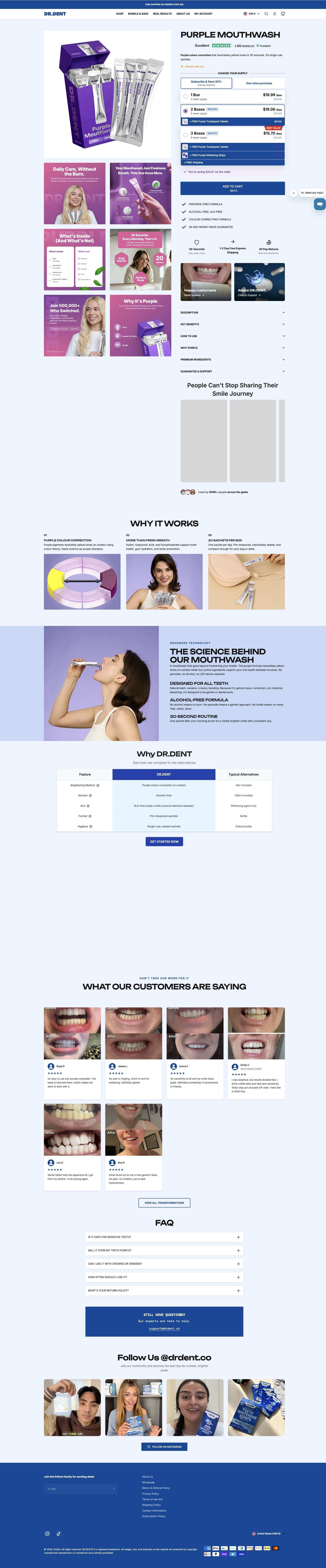
The page is a product page, the weaker rung of the ladder compared with a landing page built around one problem, but it's a busy one. The supply picker sits right under the title with Subscribe & Save 20%, a 2 Boxes option that adds free Purple Toothpaste Tablets, and a 3 Boxes Best Value option that adds tablets, strips and free shipping. Because this ad sells the subscription and the 3-Pack, the page matches it well: the supply picker opens on Subscribe & Save 20% and labels three boxes Best Value, with a running total of what you're saving. A How To Use accordion and the 30-Second Routine copy in the science section repeat the diagram's steps.
The page it sends people to: How Dr.Dent's Purple Mouthwash page builds a bigger first order
Dr.Dent's Purple Mouthwash product page, in US dollars, opens on a supply picker that adds free tablets and strips to multi-box orders, then explains the colour correction, compares itself with typical mouthwash and shows before-and-after reviews. Five ads in the library send people here, mostly creator demos built on the 30-second rinse.
How the page is built
- 01Buy box and supply picker
Title, Trustpilot rating, a 30-second colour correction promise, an Almost sold out label and a Subscribe & Save 20% picker with free gifts answer what is it and which option should I pick.
- 02Image gallery
Infographic tiles like Daily Care, Without the Burn, What's Inside (And What's Not) and Why It's Purple explain the product for people who scroll the images instead of the text.
- 03Checklist and trust icons
Peroxide-free, alcohol-free, SLS-free and a 30-day money-back guarantee sit beside shipping and returns icons, answering is it gentle and what if I don't like it.
- 04Detail accordions
Description, key benefits, how to use, why purple, ingredients and guarantee are tucked into accordions for buyers who want specifics.
- 05Smile journey videos
A carousel titled People Can't Stop Sharing Their Smile Journey, with a 500K+ users line, aims to show real people using it (the cards were blank in our capture).
- 06Why It Works
Three columns cover purple colour correction, more than fresh breath and 20 sachets per box, answering how does it whiten.
- 07The science behind our mouthwash
A photo-led block explains it's designed for all teeth, alcohol-free and a 30-second routine, answering is it safe for my mouth.
- 08Why DR.DENT comparison
A feature table sets Dr.Dent against typical alternatives on brightening, alcohol, SLS, format and hygiene, with a Get Started button.
- 09Customer before-and-afters
Review cards topped by before-and-after smile photos, with names and star ratings, answer does it really change how teeth look.
- 10FAQ and support
Questions on sensitivity, purple staining, crowns and veneers, frequency and returns, followed by a support email block.
- 11Instagram grid
Customer selfies with the product and a follow button close the page with social proof.
The first fixes we would make
- The creator videos that send people here aren't on the page; the smile journey carousel rendered as blank cards in our capture. Put two or three of the actual ad creators' clips in that slot, so someone arriving from a demo sees the same kind of proof again.
- The before-and-after reviews sit near the bottom, after the science and comparison sections. Move one or two of those smile photos up beside the buy box, since visible results are the first thing a whitening shopper wants.
Read the full breakdown of this page
Three hooks you could test
- Show a specific moment of use. “Brush, tear, swish, done. Thirty seconds before you leave the house.”
- Turn the benefit into a picture people get in a second. “One box at home, one in your bag, one in the car.”
- Lead with the uncomfortable problem. “Noticed your teeth look yellower in every photo lately?”
What to borrow for your brand
- Draw your routine as three numbered panels in the creative, so how to use it is answered before the click.
- Sell a multi-pack by naming where each unit lives (home, bag, car) instead of leading with the discount.
- Print an honest expectation line on the creative when the result is temporary, so the claim reads as careful rather than inflated.
One of 12 Dr Dent ads in the Fluid Inspiration Library, captured from the Meta Ad Library on Oct 21, 2026. We record that an ad ran publicly, not how it performed.