
CymbiotikaSponsored
Esc
How Cymbiotika turns absorption into a street-interview taste test
A 51-second street interview for Cymbiotika, shot in black and white. The host asks a passer-by what she spends on supplements, claims most capsules and gummies only absorb about 20%, and works out what that means on $100. She tastes the D3 + K2 + CoQ10 packet on camera. There's no offer, and Learn more opens the best sellers collection.
Cymbiotika
1 creative lead here1 / 1
Best-selling supplements
Creative, ad copy, and CTA link captured directly from Meta Ad Library on October 21, 2026. The linked destination was visited.
Not All Supplements Are Equal
Compare the education-led story with the purchase offer, ingredient explanations, and evidence presented on the page. Statements shown belong to the advertiser. Compare the creative with the destination and explore the other ads sharing this route.
- Brand
- Cymbiotika
- Observed offer
- Not All Supplements Are Equal
- Creative angle
- Product demonstration
- Page type
- Collection page
- Ad format
- Video · 0:52
- Listed start date
- Sep 10, 2026
- Captured
- Oct 21, 2026
- Library ID
- 1380238147553770
- Destination
- cymbiotika.com
Selected for its design and offer structure. Ad performance isn’t available in this collection.
What this ad does well
This ad makes an abstract claim feel like money. The host asks how much the person spends, then works the brand's absorption claim into dollars (on $100 a month, she says you'd only be getting about $20 worth), so the viewer does the math on their own spending without being told to. The taste test adds a second reason to watch: she rips the packet, sips it, says it tastes like tangerine and finishes it. The street-interview format and the black-and-white look make it feel unscripted, which suits a claim people are wary of.
What's missing
The numbers carry the ad, and none of them has a visible source. The 20% figure and the up to 3 times absorption claim appear as on-screen text with no citation, which matters for a skeptical supplement buyer. The close is also soft: it ends on try Cymbiotika, with no product name in the CTA and no offer, then lands on a grid of ten products. If you make one like this, put a one-line source on screen when the number appears, and send viewers to the exact product they watched someone taste, with the first-subscription discount in view.
Beat by beat
- 0-5sA woman sips from a packet on a city sidewalk as the host says she's going in for more.
Opening on the reaction makes the viewer curious about what she's tasting before any pitch starts.
- 5-20sThe host asks what she spends each month, then claims most capsules and gummies only absorb about 20%.
Starting with the viewer's own spending makes the claim personal before it's stated.
- 20-30sThe host works it out on $100 a month and says you'd only get about $20 worth.
Turning a percentage into dollars makes the problem feel like money wasted, which is easier to care about.
- 30-51sShe tears open the D3 + K2 + CoQ10 packet, says it tastes like tangerine and finishes it while text claims up to 3 times more absorption.
The taste test shows the format is easy to take, and the claim on screen ties it back to the absorption story.
Where it sends people
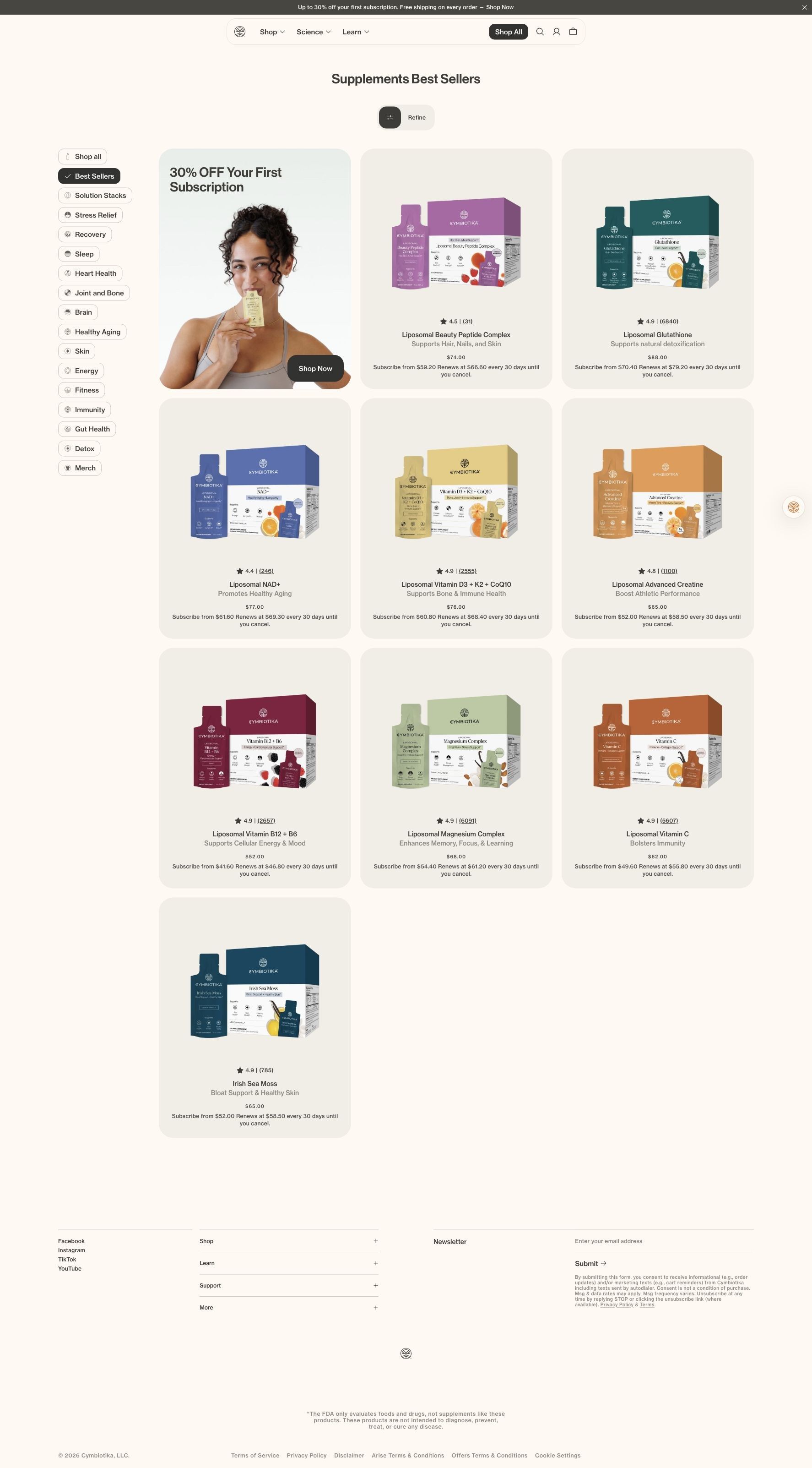
The ad sends people to the best sellers collection, a grid of ten products plus a tile offering 30% off your first subscription, which is the weaker end of the landing-page ladder. The page shows star ratings and subscribe-and-save prices for every product, so a returning shopper can move fast. But the viewer just watched one packet get tasted and heard one argument, and neither is repeated here: the D3 + K2 + CoQ10 card sits in the grid with no absorption explanation. The brand's own absorption explainer page, or the D3 product page, would pick up the story where the video ends.
The page it sends people to: What Cymbiotika's best sellers collection page shows
Cymbiotika's best sellers collection is a product grid with a filter sidebar and a promotional tile offering 30% off your first subscription. Each card shows a star rating, a one-line benefit and subscribe pricing. One ad in the Fluid library sends people here, a black-and-white street interview about supplement absorption and a taste test.
How the page is built
- 01Promo bar
A top banner with up to 30% off a first subscription and free shipping answers whether there's a deal.
- 02Category sidebar
Need-based filters with Best Sellers selected answer where else to browse.
- 03First-subscription tile
A lifestyle photo with 30% off your first subscription and a Shop Now button answers what a new customer gets.
- 04Product grid
Ten product cards with ratings, benefits and subscribe pricing answer which popular product to try and what it costs.
- 05Footer
Social links, menus and a newsletter signup answer how to stay in touch.
The first fixes we would make
- The street-interview ad builds one argument (absorption) around one product (D3 + K2 + CoQ10), and the grid repeats neither. Send that traffic to the D3 product page or the absorption explainer, or add a short absorption banner above this grid.
- There's no guidance on where to start. Badge one or two cards (most reviewed, best first purchase) or add the variety pack to the grid so a newcomer has an obvious first pick.
Read the full breakdown of this page
Three hooks you could test
- Turn the benefit into a picture people get in a second. “You spend $100 on supplements. How much do you actually keep?”
- Make the product the whole scene. “We handed a stranger one packet and filmed her reaction.”
- Call out the habit you're replacing. “Still chewing gummies that taste like candy and do who knows what?”
What to borrow for your brand
- Ask the person on camera what they spend first, then show what your claim means in dollars, so viewers run the math on themselves.
- Film the first taste on camera and keep the honest reaction in, because a real response sells the format better than a voiceover.
- Put a short source line on screen whenever a statistic appears, so the number reads as evidence rather than a slogan.
Transcript
She's going in for more. How much do you think you spend on supplements every month? Probably like $10. I used to take a lot for track, actually, but some of them tasted really, really bad. Did you know that most supplements like those gummies or like capsules out there? You're only absorbing about 20% of what you take. That's not good. For someone who is a big supplement person, let's say they spend $100. Means that you're only getting about $20 worth of those supplements. Okay, that's crazy. You're peeing out 8 dollars. Not fair. We deserve to get all the absorption. I have in my hands, symbiotic is vitamin D3, plus K2, plus co Q10, Rip it open, take a little sip. Oh, it's like a little jelly. Can you finish it all? must be pretty good. pretty good. It tastes like tangerine too. It's better tasting than most Actually, these are tested by a third-party lab, too. This gets absorbed 3 times more than like capsules or gummies because your body is absorbing it. kind of like food. It creates like a little fat bubble. Your supplements should actually be doing something. Try symbiotica.
Text on screen
- She'sgoing in for more!
- you spend on
- Probably like $10
- lused to take a lot for track 1
- tasted really, really bad!
- Did you know that most
- supplements, those
- there, you're only
- ino
- absorbing about
- of what you take?
- 3525 05)
- For someone who ist
- spend $100
- getting about
- of those supplements
- 1052473
- 40 33950478
- Okay that's crazy!
- AE 120520710
- We deserve to get all the
- I have in my hand
- 20%
- LIPOSOMAL
- Vitamin D3 +
- Bone, Joint+
- Immune Support
- TANGERINE
- Supports:
- K2 + CoQlO
- Immune Support*
- Jontand
- Bone Heath'
- Heart:
- DIETARY SUPPLEMENT 5m6/017802)
- rip it
- He finished it all!
- So actually
- by a third-party lab too.
- UP TO 3 TIMES
One of 12 Cymbiotika ads in the Fluid Inspiration Library, captured from the Meta Ad Library on Oct 21, 2026. We record that an ad ran publicly, not how it performed.