

ComfrtSponsored
Esc
How Comfrt's Minimalist Hoodie page sells the matching set
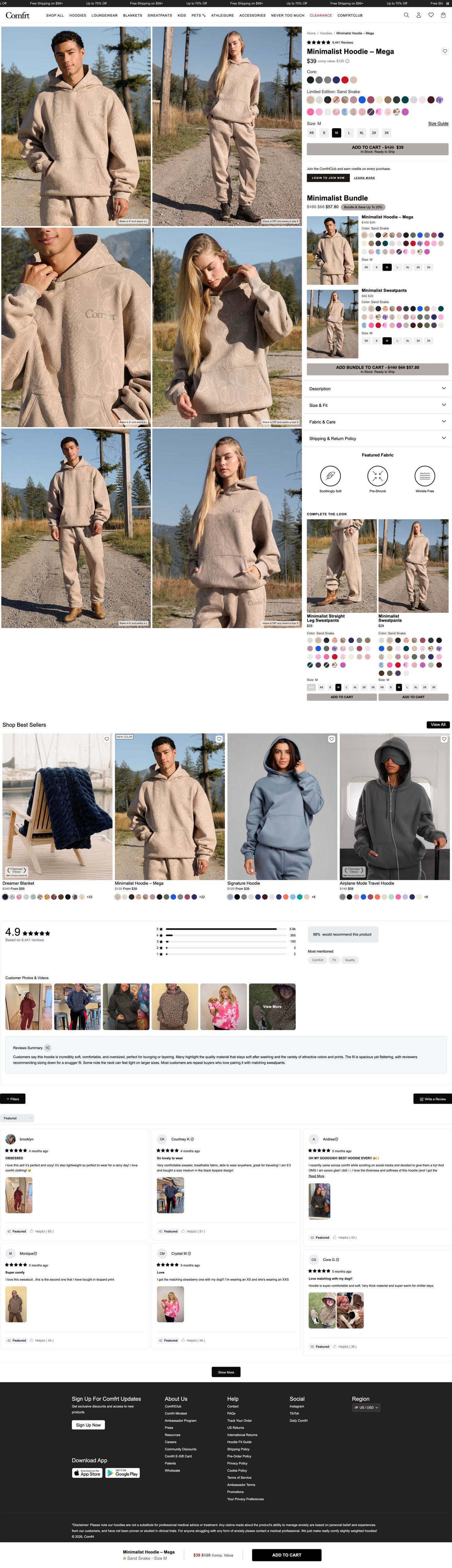
Comfrt's Minimalist Hoodie product page pairs a two-column grid of outdoor photos with a buy column that sells the matching set right under Add to cart, then reviews that open with a written summary. Two ads in the Fluid library send people here, both introducing the Chocolate Milk and Strawberry Milk cow prints: a flat lay and a creator reveal.
Comfrt
2 creatives lead here1 / 2

Minimalist Hoodie product page
Native screenshot captured from the public Meta Ad Library. Destination captured while scrolling on October 20, 2026; current offers and default variants may differ from the original creative.
Minimalist Hoodie product page
Comfrt's Minimalist Hoodie product page pairs a two-column grid of outdoor photos with a buy column that sells the matching set right under Add to cart, then reviews that open with a written summary. Two ads in the Fluid library send people here, both introducing the Chocolate Milk and Strawberry Milk cow prints: a flat lay and a creator reveal.
- Brand
- Comfrt
- Page type
- Product page
- Ads leading here
- 2
- Captured
- Oct 20, 2026
- Destination
- comfrt.com
Selected for its design and offer structure. Ad performance isn’t available in this collection.
What this page does well
The photo grid answers fit before anyone asks: six large outdoor shots of two models in the matching set alternate full-body photos with fabric and logo close-ups, each captioned with the model's height and size. Swatches are split into a core row and a separately named limited-edition group, so new colorways get their own label. The bundle builder under Add to cart gives the hoodie and matching bottom each their own swatches and sizes under one bundled price with a save tag. Reviews open with a written summary, most-mentioned chips and a customer photo strip before the grid, and a sticky bottom bar restates the chosen color, size and price beside Add to cart.
How the page is built
- 01Ticker and header
Sale and free-shipping lines plus a category nav with clearance in red set the deal context before the product.
- 02Photo grid
Six outdoor photos with model height and size captions answer how it fits and how it looks in real life.
- 03Buy column
Star rating, price with a comparison value, core and limited-edition swatches, size buttons with a Size Guide link and Add to cart answer what it costs and which color and size to choose.
- 04Bundle builder
Top and matching bottom rows, each with its own swatches and sizes under one sale price, answer whether to buy the full set.
- 05Accordions and fabric icons
Description, size and fit, fabric and care, and shipping and returns, plus a Featured Fabric row, cover the detail questions.
- 06Complete the look
Two cross-sell cards with their own Add to cart add pieces that go with the set.
- 07Best sellers
Four product cards with badges and sale prices give undecided shoppers another route.
- 08Reviews
Rating, distribution bars, a recommend chip, most-mentioned chips, a photo and video strip and a written summary answer what other buyers think.
- 09Footer and sticky bar
A sticky bar with the chosen color, size, price and Add to cart keeps buying one tap away.
What's missing, in the order we'd fix it
- Both ads sell cow print, but in the capture the page opened on its default color. Link the ads to the cow-print variant, or preselect it, so the hoodie from the ad is the first thing on screen.
- The creator's ad leans on the oversized fit and big hood, but the fit details sit inside the size and fit accordion. Put a one-line fit note (oversized, size down for a closer fit) right beside the size buttons.
- The limited-edition label is the only scarcity cue, and it doesn't say how limited. If a print is a limited run, add a true stock or date line inside that swatch group.
How the ads set it up
Two ads land here: a 13-second flat lay of the Chocolate Milk cow print and a one-minute creator reveal of Strawberry Milk. Both set up the limited-edition swatch group nicely, and the creator's talk about sizes and pairing with sweatpants is answered by the model captions and the matching-set bundle builder. The weak point is the first screen: neither cow print is preselected in the capture, so a shopper who tapped for a specific print has to find it in the swatches.
What to borrow for your brand
- Caption every on-model photo with the model's height and size worn, so fit answers sit next to the size picker.
- Split swatches into core colors and a named limited-edition group so new colorways get their own spotlight.
- Open reviews with a written summary and most-mentioned chips before the individual cards.
Ads that send people here
- How Comfrt teased a cow-print drop with a 13-second flat lay
- How a creator sold Comfrt's Strawberry Milk cow-print hoodie
Captured from comfrt.com in October 2026 for the Fluid Inspiration Library. Offers and prices change; this is what the page showed when we captured it.