

Em Miller with AG1 by Athletic GreensSponsored
Esc
How AG1 sells its Pro launch with a receipt in the hero
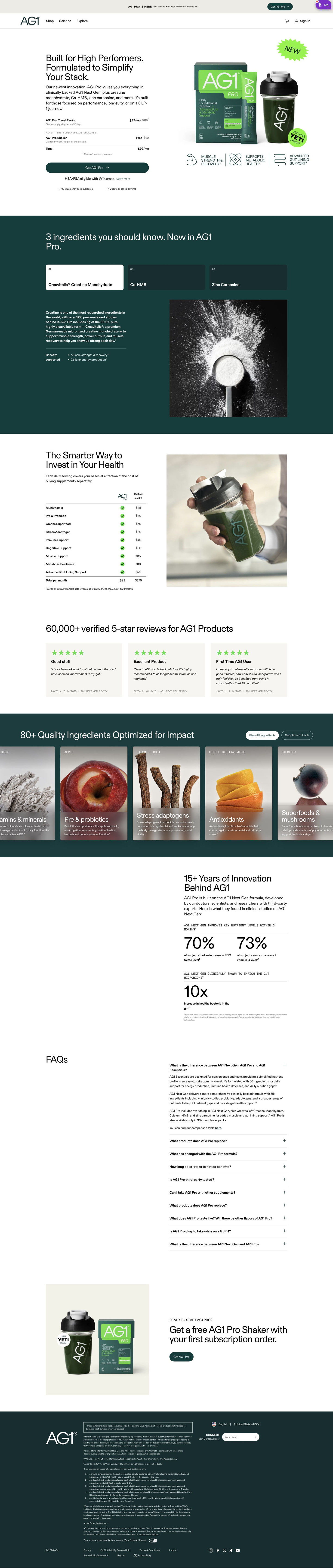
AG1's Pro launch page sells a premium tier to high performers. A two-column hero shows the offer as a receipt-style order summary, followed by new-ingredient tabs, a cost table, reviews, an ingredient carousel, research stats, FAQ and a closing gift band. Nine ads in the Fluid library land here, seven of them "One Pack. The Whole Stack." launch ads.
AG1
9 creatives lead here1 / 9
AG1 Pro for high performers
A browser shopping-extension badge appears in the upper-right margin of this capture.
AG1 Pro for high performers
AG1's Pro launch page sells a premium tier to high performers. A two-column hero shows the offer as a receipt-style order summary, followed by new-ingredient tabs, a cost table, reviews, an ingredient carousel, research stats, FAQ and a closing gift band. Nine ads in the Fluid library land here, seven of them "One Pack. The Whole Stack." launch ads.
- Brand
- AG1
- Page type
- Dedicated offer
- Ads leading here
- 9
- Captured
- Oct 19, 2026
- Destination
- drinkag1.com
Selected for its design and offer structure. Ad performance isn’t available in this collection.
What this page does well
The hero does something most offer pages skip: it shows the order as a small receipt, with the product line, the struck-through and sale monthly price, a first-subscription gift marked free and a total, all sitting right above the full-width button. A visitor knows exactly what they're paying and getting before they click. The launch story carries through the whole top half, with a NEW starburst on the pack shot, a launch line in the announcement bar and a dark band of tabs covering only the added ingredients (so existing AG1 drinkers can see what changed). Then the cost comparison makes the whole-stack promise literal by pricing each category the product covers as a separate purchase and totaling it against the one subscription.
How the page is built
- 01Announcement bar and header
A launch line with a welcome-kit mention and its own small button tells visitors something new is on offer before they read the hero.
- 02Receipt hero
A headline naming the audience sits above an order summary (subscription line, free gift, total) and a full-width button, answering what do I get and what does it cost.
- 03New-ingredient tabs
Three numbered tabs on a dark band explain the added ingredients, answering what's different about Pro.
- 04Cost comparison
A table prices each covered category bought separately against the single subscription, answering whether Pro is worth the money.
- 05Review cards
A verified review count and three quote cards answer whether other people are happy with it.
- 06Ingredient carousel
Tall scrolling cards show each ingredient with a photo, category and short description, with buttons for the full list and supplement facts.
- 07Research stats
A headline about years of development leads into grouped stat figures with footnotes, answering whether there's science behind the claims.
- 08FAQ
An accordion opens on a question comparing the product line-up, answering which version is right for me.
- 09Closing offer band
The free-gift-with-first-subscription hook returns beside a pack shot with one button, giving people who read to the end a clear way to buy.
- 10Newsletter and footer
A dark band holds the disclaimer, footnotes, newsletter field and legal links.
What's missing, in the order we'd fix it
- The first proof on the page is the review section, which sits below the ingredient tabs and the cost table. Put the star rating and verified review count in the hero, right next to the order summary, so the promise and the proof arrive together.
- We didn't see a money-back guarantee near the button. Add one line under the CTA naming the guarantee window, because a first-time buyer committing to a premium subscription is weighing exactly that risk.
- There's no timeline of what to expect after starting. A short week-by-week or month-by-month section after the ingredient tabs would answer when will I notice a difference, which is the question a high performer asks next.
How the ads set it up
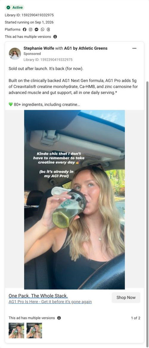
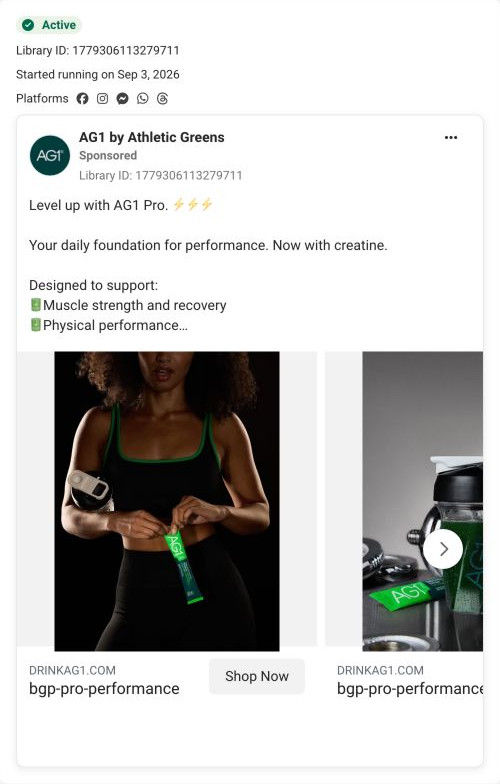
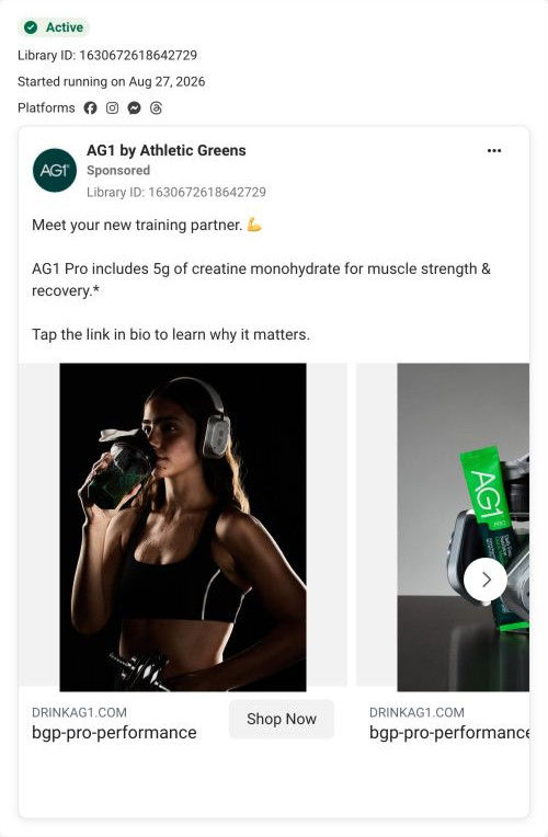
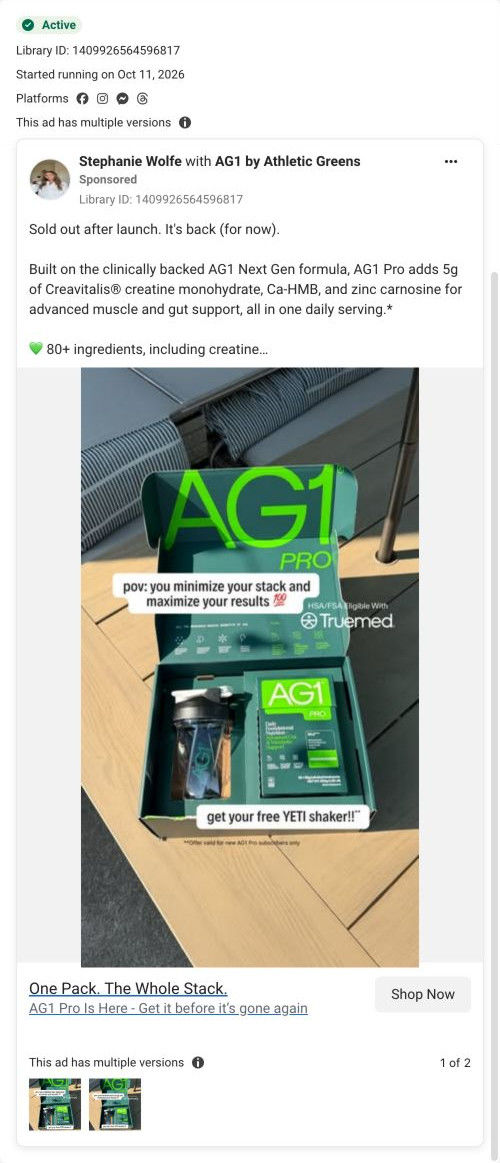
Seven of the nine ads are launch ads (five images and two videos) built on "One Pack. The Whole Stack.", and the page picks that up with a NEW sticker, a launch line in the announcement bar and a section on just the added ingredients. The cost table is the real payoff, because it turns the ad's one-pack claim into line items a visitor can check. The two other ads take a benefits angle and a training-partner use occasion, and neither gets a scene of its own on the page, so if you run varied angles like these, give each one a section or image that echoes it.
What to borrow for your brand
- Show your offer as a mini receipt in the hero (subscription line, free gift with its struck-through value, total) directly above the buy button.
- Back a consolidation headline with a table that prices each replaced category separately and totals it against your one product.
- Repeat the first-order gift in a closing band after the FAQ, with a pack shot and a single button, for visitors who read the whole page.
Ads that send people here
- How AG1 sold Pro's creatine with a creator selfie in a parked car
- How AG1 announced creatine in Pro with a two-card gym carousel
- How AG1 Pro's training-partner carousel leads with creatine
- How AG1 Pro's creator ad turns ad fatigue into the hook
- How AG1 paired an open Pro welcome kit with a back-in-stock line
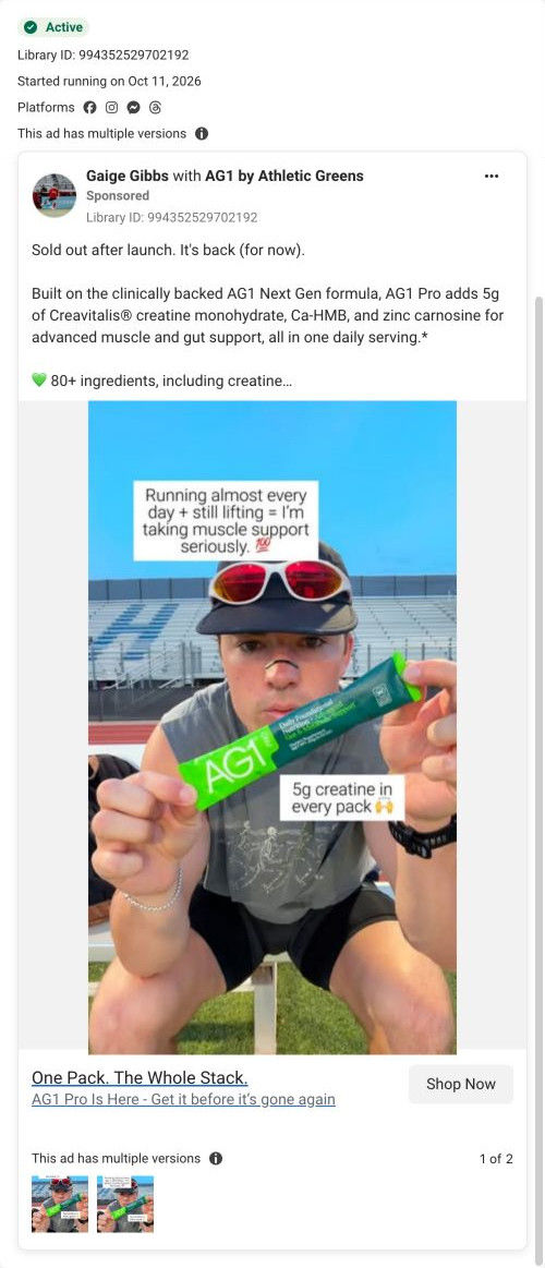
- How AG1 Pro matched creatine to a creator who runs and lifts
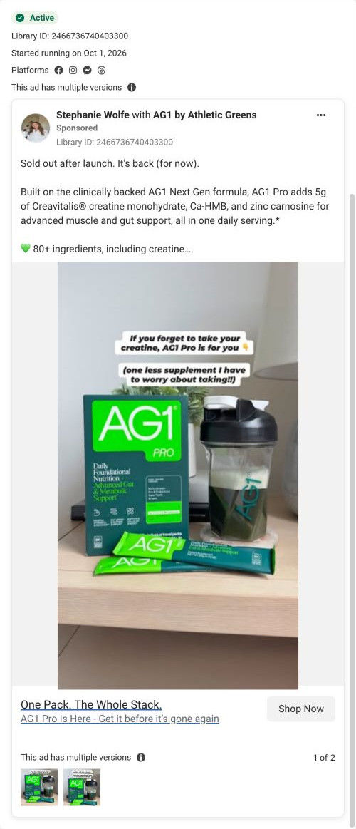
- How AG1 sold Pro's restock to people who forget their creatine
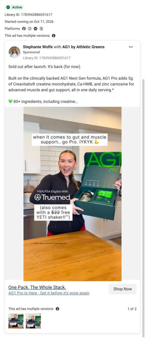
- How AG1 anchors a free shaker at $22 in a creator's 'go Pro' image
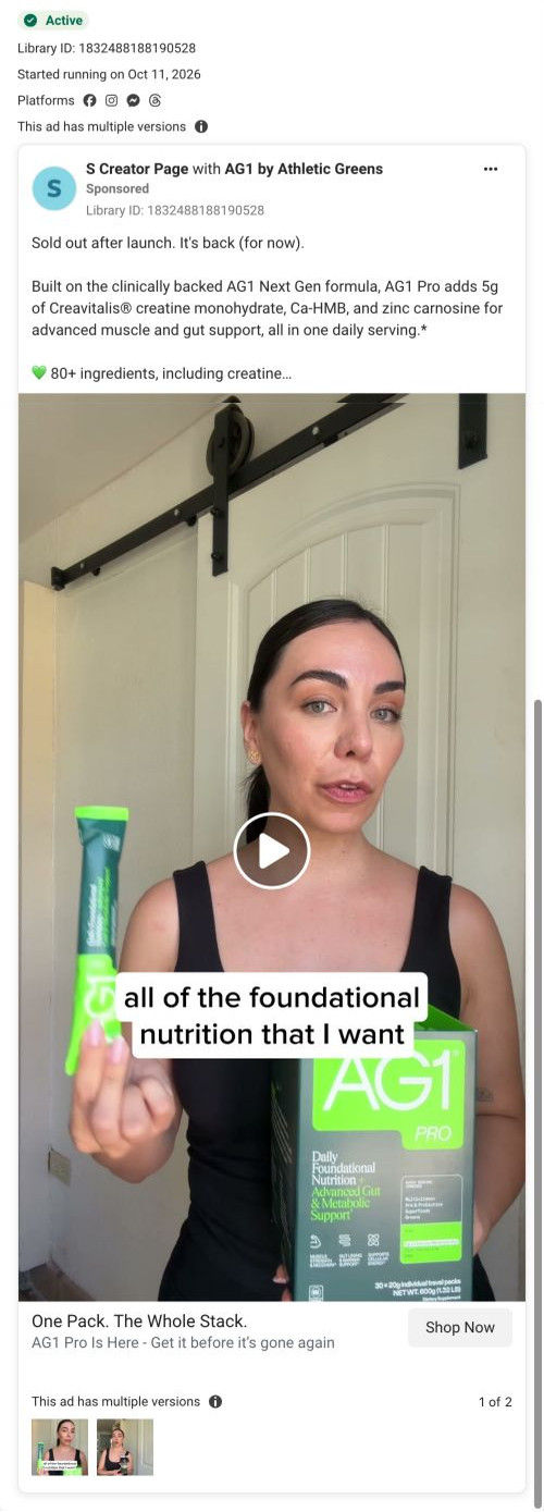
- How AG1 uses a talking-head creator video to sell Pro's one pack
Captured from drinkag1.com in October 2026 for the Fluid Inspiration Library. Offers and prices change; this is what the page showed when we captured it.