

Em Miller with AG1 by Athletic GreensSponsored
Esc
How AG1 built a one-audience, one-plan page for GLP-1 users
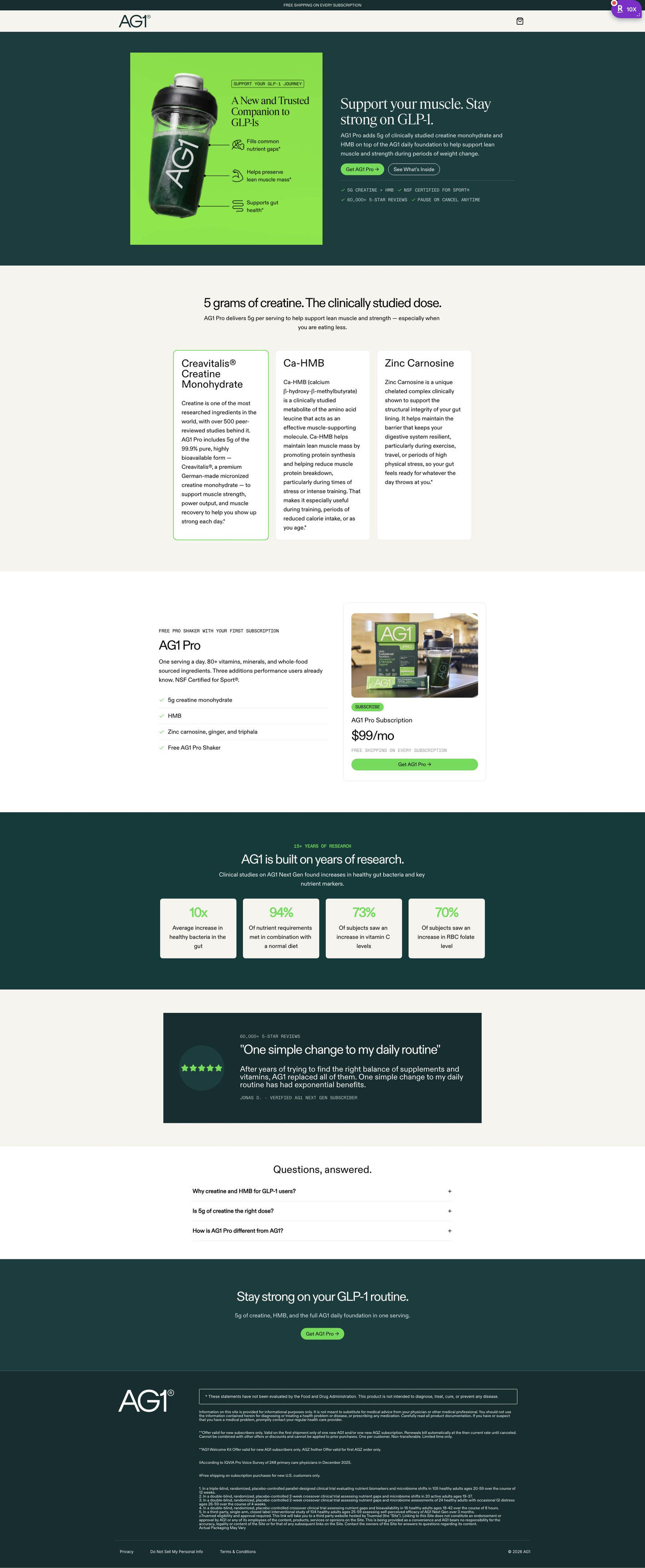
This short AG1 Pro campaign lander is written for people on a weight-loss medication. The hero names the reader's situation, three cards explain the formula, then a single subscription card, research stats, one testimonial and a three-question FAQ close the page. One audience-specific video ad in the Fluid library sends people here, built around keeping muscle while losing weight.
AG1
1 creative lead here1 / 1
AG1 Pro muscle support campaign
A browser shopping-extension badge appears in the upper-right margin of this capture.
AG1 Pro muscle support campaign
This short AG1 Pro campaign lander is written for people on a weight-loss medication. The hero names the reader's situation, three cards explain the formula, then a single subscription card, research stats, one testimonial and a three-question FAQ close the page. One audience-specific video ad in the Fluid library sends people here, built around keeping muscle while losing weight.
- Brand
- AG1
- Page type
- Audience-specific page
- Ads leading here
- 1
- Captured
- Oct 19, 2026
- Destination
- try.drinkag1.com
Selected for its design and offer structure. Ad performance isn’t available in this collection.
What this page does well
The page names the same audience everywhere a visitor looks: in the eyebrow on the hero image, the hero headline, the FAQ and the closing band, so someone who clicked the ad never wonders whether this is for them. There's only one subscription option, shown as a single card next to a checklist whose last line is a free accessory, which means there's nothing to compare and nothing to decide except yes. A See What's Inside button in the hero jumps to three ingredient cards, each with a long paragraph that explains the formula (the copy claims a specific dose of the key ingredient in the headline). The header is cut to logo and cart, so the page stays a closed loop for one reader.
How the page is built
- 01Announcement bar and header
One free-shipping line sits above a header with only the logo and cart, keeping the visitor on this page.
- 02Hero
An infographic naming the audience sits beside a headline about their situation, a buy button, a See What's Inside button and four proof chips, answering is this for me.
- 03Formula explainer
A headline naming the key ingredient dose leads three cards that each explain an ingredient, answering what's actually different here.
- 04Offer block
A checklist ending in a free accessory sits beside one subscription card with a monthly price, answering what do I get and what does it cost.
- 05Research stats
Four stat cards each show a large figure over a one-line result the brand reports, answering is there evidence behind the claim.
- 06Testimonial
One card with a review-count eyebrow, a short quote and a verified-subscriber label adds customer proof.
- 07FAQ
Three accordions answer questions written for this audience, not a general product FAQ.
- 08Closing CTA and footer
An audience headline and button repeat the ask, followed by a disclaimer box, offer fine print and study footnotes.
What's missing, in the order we'd fix it
- One testimonial is thin proof for a reader making a health decision. Add three or four reviews from subscribers in the same situation, placed right next to the subscription card.
- We didn't see a money-back guarantee on the captured page. Put one line under the subscription button naming the guarantee window, so trying it feels low-risk.
- Nothing tells the reader what to expect over the first weeks. A short timeline after the formula cards would answer when they should notice a difference, framed as what the brand reports.
How the ads set it up
The ad's muscle-preservation message carries straight into the page, which names the same audience in the image eyebrow, the hero headline, the FAQ and the closing band. That repetition is what makes a single-audience lander feel built for the click. Any health benefits on the page are the advertiser's claims, backed on the page with study footnotes, and if you write for a medical audience like this, keep those claims attributed and sourced the same way.
What to borrow for your brand
- Offer one subscription option as a single card beside a checklist whose last line is a free accessory, so there's nothing to compare.
- Pair an infographic hero image with a See What's Inside secondary button that jumps to your ingredient explanation.
- Keep the FAQ to three questions written for the audience your ad targeted, instead of reusing the general product FAQ.
Ads that send people here
Captured from try.drinkag1.com in October 2026 for the Fluid Inspiration Library. Offers and prices change; this is what the page showed when we captured it.