

AG1 by Athletic GreensSponsored
Esc
How AG1's cabinet question ad makes you count your own supplements
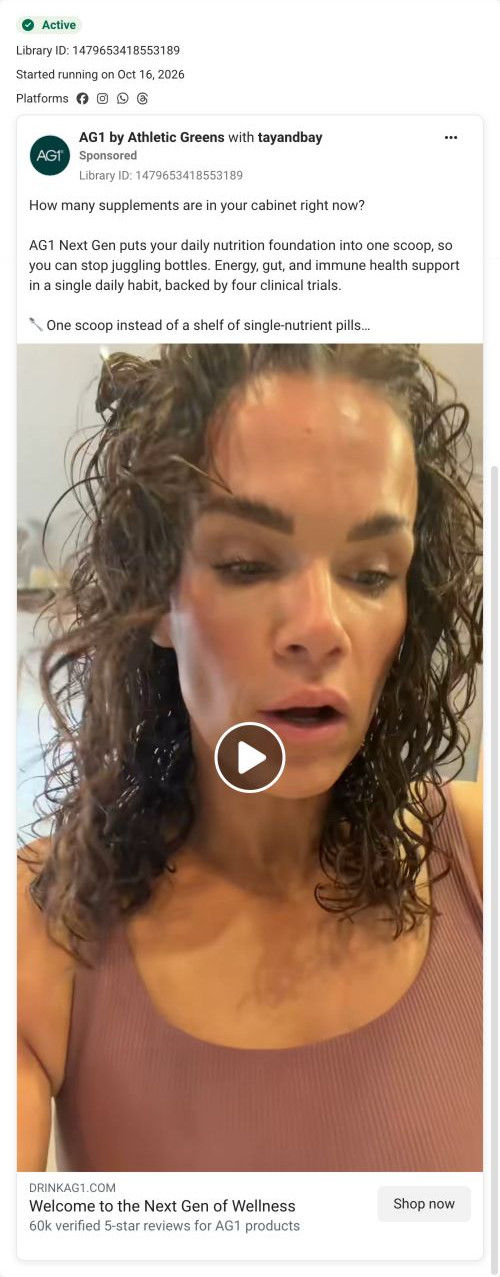
A creator video from tayandbay, run with AG1, opening on a close selfie of her talking to camera. The copy asks how many supplements are in your cabinet and pitches AG1 Next Gen as one scoop instead, citing four clinical trials. New subscribers get free travel packs, D3+K2 drops and a canister and shaker. It links to AG1's homepage.
AG1
5 creatives lead here1 / 5

The AG1 homepage
A browser shopping-extension badge appears in the upper-right margin of this capture.

How many supplements are in your cabinet right now?
The ad opens with a cabinet-full-of-supplements question and introduces a one-scoop routine before listing the welcome gifts. Its CTA uses the brand’s homepage address. Compare the creative with the destination and explore the other ads sharing this route.
- Brand
- AG1
- Observed offer
- New subscribers: 3 free Next Gen travel packs, D3+K2 drops, canister and shaker
- Creative angle
- Problem-led
- Page type
- Homepage
- Ad format
- Video
- Listed start date
- Oct 16, 2026
- Captured
- Oct 19, 2026
- Library ID
- 1479653418553189
- Destination
- drinkag1.com
Selected for its design and offer structure. Ad performance isn’t available in this collection.
What this ad does well
The copy opens with a question that makes you picture your own shelf, "How many supplements are in your cabinet right now?", which is a problem people recognize without being told. The video's first frame is an unfiltered selfie mid-sentence, with wet curly hair, so it reads as a real person talking rather than a production. The copy then gives the answer (one scoop instead of a shelf of single-nutrient pills), a proof line attributed to four clinical trials, and a checklist of new-subscriber gifts as the reason to order now.
What's missing
The ad sets up a routine-replacement argument and a gift offer, then sends people to the homepage, which leads with a launch hero and three product tiers instead of either. The value-math table that answers the cabinet question sits far down the page, and the gifts aren't on the first screen. If you make one like this, send it to a page that opens on the replacement checklist and the gift, which AG1 already has in its Next Gen offer page.
Beat by beat
- Opening frameA close, handheld selfie of the creator speaking to camera with wet curly hair.
Raw, mid-routine footage looks native to the feed.
- Copy"How many supplements are in your cabinet right now?"
The question makes viewers count something in their own home.
- CopyOne scoop to stop juggling bottles, with energy, gut and immune claims backed by four clinical trials, per the ad.
It positions the product as the replacement and adds a proof line.
- CopyOrder now and get three free Next Gen travel packs, free D3+K2 drops and a free canister and shaker, for new subscribers only.
It adds a gift incentive to act now.
- Headline"Welcome to the Next Gen of Wellness" with a subline citing 60k verified 5-star reviews for AG1 products.
It names the product and adds a review count, attributed to AG1, by the button.
The offer
New subscribers get three free Next Gen travel packs, free Vitamin D3+K2 drops and a free canister and shaker, per the copy.
Where it sends people
This ad lands on the AG1 homepage, the weakest rung on the ladder, and 5 of the AG1 ads in our library go there through tracking links. Three product cards and a full comparison table come before any routine-replacement content. The homepage's value-math table, which prices each category bought separately, is the closest match to the cabinet question, but it's far down the page. The new-subscriber gifts in the copy aren't the focus of the first screen, so the reason to act now is lost on arrival.
The page it sends people to: How AG1's homepage works as a product chooser for ad traffic
AG1's homepage works as a product chooser. A launch hero, three tier cards and a full comparison table come first, followed by a goals block, customer videos, ingredients, quality standards, value math, endorsements and a guarantee band. Five ads in the Fluid library link here, spanning use-occasion, creator story, launch and problem-led angles.
How the page is built
- 01Ticker and hero carousel
A launch slide with one CTA sits above a trust strip of four badges (certification, research, expert backing, risk-free guarantee), answering why should I trust this brand.
- 02Product range
Three product cards, the middle one tagged Most Popular, show price and a benefit checklist, answering which one is for me.
- 03Comparison table
Three product columns run through format, ingredient count, certification and ingredient checks, ending in price rows, answering what's the difference between them.
- 04Goals block
Five a-formula-for-you-if bullets and a Get Started button sit beside lifestyle photos, answering does this match what I want.
- 05Customer videos and press
A customer-count headline, three video testimonials and three publication logos answer who else uses it.
- 06Ingredients carousel
Photo cards per ingredient category scroll on a dark band, answering what's in it.
- 07Quality standards
An athlete photo with a certification badge sits beside copy on third-party testing, answering is it safe and tested.
- 08Value math
A table prices each supplement category bought separately against the products' monthly totals, then a Compare Products prompt, answering is it worth the money.
- 09Endorsements and reviews
An athlete, expert and celebrity carousel is followed by three written reviews.
- 10Featured products
A launch banner sits above a four-card grid tagged Best Seller, Enhanced and New.
- 11Guarantee band
A full-bleed band names the risk-free window and support contact and ends on Try It Risk Free, answering what if it doesn't work for me.
- 12FAQ, blog and footer
Eight accordions, a blog carousel and a long footer close the page.
The first fixes we would make
- Five very different ads land on the same general first screen, which is the weakest rung on the landing-page ladder. Start with the problem-led ad and send it to a page that opens on the value math table, since that table is the direct answer to its question.
- The creator ad features Cleetus McFarland, and nothing on the homepage mentions him. Give creator ads a page, or at least a hero slide, that picks up the creator's story.
Read the full breakdown of this page
Three hooks you could test
- Lead with the uncomfortable problem. “How many half-empty supplement bottles are in your cabinet right now?”
- Call out the habit you're replacing. “Stop juggling bottles every morning. One scoop covers the basics.”
- Turn the benefit into a picture people get in a second. “A crowded shelf of bottles, then one canister standing alone.”
What to borrow for your brand
- Open the copy with a question that makes the viewer count something in their own home, so they supply the problem themselves.
- Pair problem-led copy with raw creator selfie footage so the ad feels native to the feed.
- Send problem-led ads to a page that answers that problem on the first screen, not to a general chooser.
One of 65 AG1 ads in the Fluid Inspiration Library, captured from the Meta Ad Library on Oct 19, 2026. We record that an ad ran publicly, not how it performed.