How AG1 launched a new format on a closed-loop gummies lander
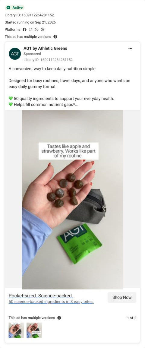
AG1's Essentials Gummies campaign page launches a new product format with navigation cut to logo and cart. It pitches convenience against the brand's core powder, warms up with value props, a problem statement and a product intro, then places one buy box mid-page. One launch image ad in the Fluid library lands here, announcing daily nutrition in a new format.


The Essentials Gummies campaign
AG1's Essentials Gummies campaign page launches a new product format with navigation cut to logo and cart. It pitches convenience against the brand's core powder, warms up with value props, a problem statement and a product intro, then places one buy box mid-page. One launch image ad in the Fluid library lands here, announcing daily nutrition in a new format.
- Brand
- AG1
- Page type
- Dedicated offer
- Ads leading here
- 1
- Captured
- Oct 19, 2026
- Destination
- try.drinkag1.com
Selected for its design and offer structure. Ad performance isn’t available in this collection.
What this page does well
AG1 pitches the gummies against its own core product (no powder, no shaker), which borrows the trust the brand already has and explains the new format in one comparison. Navigation is cut to logo and cart, so every link on the page leads to the one product. The page warms up before asking: value props, a trust card with reviews, clinical testing and a money-back guarantee, a problem statement and a product intro all come before the single buy box, and every earlier CTA repeats that one action. Big-number stats (ingredient count, gummies per serving) work as headline proof, and a small table against ordinary gummies answers the obvious why-not-cheaper question.
How the page is built
- 01Announcement ticker
Scrolling assurances (guarantee, reviews, certification, pause or cancel anytime) answer can I trust this.
- 02Header
Logo and cart only, so the page stays a closed loop.
- 03Hero
A headline built on number of nutrients and number a day, a paragraph contrasting the format with powder and a shaker, four claims and a CTA answer what's new here.
- 04Value props
Three columns cover convenience, real life and quality standards.
- 05Trust card
Reviews, clinical testing and a money-back guarantee in one panel answer is it safe to try.
- 06Problem statement
A headline about daily nutrition being hard and a paragraph on diet gaps answer why would I need this.
- 07Product intro
A photo of someone eating a gummy beside two big-number stats answers what do I actually get.
- 08Buy box
An infographic gallery beside a struck-through price with per-serving cost, Add to Cart and three perks answers what does it cost.
- 09Ingredients
Four ingredient-category cards plus free-of and certification statements answer what's in it.
- 10Nutrition panel
A simple nutrition table beside the gummies in a hand.
- 11Comparison and quality
A small table against ordinary gummies and an athlete photo with a certification badge answer why these and not the cheap ones.
- 12FAQ and footer
Five accordions and a compact legal footer.
What's missing, in the order we'd fix it
- There are no written reviews on the page, only a review count in the ticker and trust card. Add three short reviews right after the buy box, ideally from people who switched from the powder.
- The buy box sells a single price with no longer supply. Add a second, longer plan with a per-serving saving, so convinced buyers can commit to more than a month.
How the ads set it up
The ad announces daily nutrition in a new format, and the hero explains that format straight away by contrasting it with the brand's own powder and shaker. Every earlier CTA points to the one mid-page buy box, so the page builds the case in order and only then asks for the sale. It's a good model for launching a format extension: lead with what's different from the product people already know.
What to borrow for your brand
- Pitch a new format against your own core product, so the launch borrows trust you've already earned.
- Cut navigation to logo and cart on a launch lander, and point every CTA at one buy box.
- Use two big-number stats (how much is in it, how much you take) as your product's headline proof.
Ads that send people here
Captured from try.drinkag1.com in October 2026 for the Fluid Inspiration Library. Offers and prices change; this is what the page showed when we captured it.