

AG1 by Athletic GreensSponsored
Esc
How AG1 answered Why Gummies? with four icons and a box
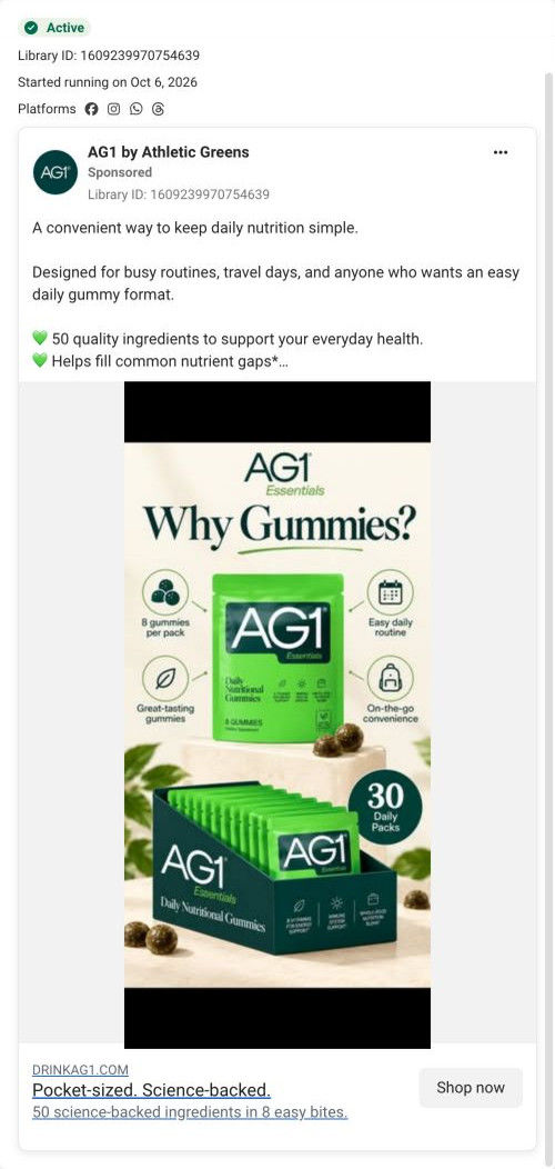
A static infographic ad for AG1 Essentials gummies that ran on Meta from Oct 6, 2026. A Why Gummies? headline sits over the pouch, four icon callouts and a display box of 30 daily packs. The copy pitches busy routines and travel days and a $1.63-per-serving price, and the link goes to AG1's homepage.
AG1
5 creatives lead here1 / 5

The AG1 homepage
A browser shopping-extension badge appears in the upper-right margin of this capture.

Pocket-sized. Science-backed.
The ad presents gummies as an option for busy routines and travel days, supported by an advertised cost per serving. Its CTA uses the brand’s homepage address, a different handoff from the same message’s product-page ads. Compare the creative with the destination and explore the other ads sharing this route.
- Brand
- AG1
- Observed offer
- AG1 Essentials gummies — advertised at $1.63 per serving
- Creative angle
- Use occasion
- Page type
- Homepage
- Ad format
- Image
- Listed start date
- Oct 6, 2026
- Captured
- Oct 19, 2026
- Library ID
- 1609239970754639
- Destination
- drinkag1.com
Selected for its design and offer structure. Ad performance isn’t available in this collection.
What this ad does well
The headline asks the exact question a greens-powder customer would ask about a new format, Why Gummies?, so the ad reads as an answer to a doubt instead of a pitch. Four line-icon callouts answer it around the pouch: 8 gummies per pack, an easy daily routine, great-tasting gummies and on-the-go convenience. A display box with a 30 Daily Packs badge shows how a month of supply arrives without any copy. The text adds NSF Certified for Sport and $1.63 per serving for people who expand it.
What's missing
The biggest gap is the destination. The same copy runs elsewhere pointing to the gummies product page, but this version sends people to the homepage, where the gummies are one choice among several tier cards and they have to find them again. The image also leaves out the price, which is the most persuasive fact in the copy. If you make one like this, send it to the product page (or a page built for one audience, like busy parents) and put the per-serving price on the image next to the 30-pack box.
Beat by beat
- HeadlineWhy Gummies? in large serif type under the AG1 Essentials logo.
It names the format question directly, so the rest of the image reads as the answer.
- ImageFour line-icon callouts around the pouch: 8 gummies per pack, easy daily routine, great-tasting gummies, on-the-go convenience.
It answers the question with four reasons someone can scan in a second.
- ImageA display box of individual packs with a 30 Daily Packs badge.
It shows how much arrives in a month without any explanation.
- CopyBusy routines and travel days, 50 ingredients, NSF Certified for Sport and $1.63 per serving.
It adds trust and price for readers who expand the copy.
- HeadlinePocket-sized. Science-backed., with 50 science-backed ingredients in 8 easy bites.
It restates portability and serving size at the click.
The offer
The copy advertises the gummies at $1.63 per serving, with no gift or discount.
Where it sends people
This version lands on AG1's homepage, the weakest rung on the persona's ladder for a single-product ad. The homepage acts as a product chooser: a launch hero, then three tier cards with the middle one tagged Most Popular, then a long comparison table, so someone who clicked for gummies has to pick them out again. The Featured products grid further down also lists the range. The same message sent to the gummies product page would land on a buy box with the per-serving price, which is the handoff this ad needs. It's one of five ads in the Fluid library that point to the homepage.
The page it sends people to: How AG1's homepage works as a product chooser for ad traffic
AG1's homepage works as a product chooser. A launch hero, three tier cards and a full comparison table come first, followed by a goals block, customer videos, ingredients, quality standards, value math, endorsements and a guarantee band. Five ads in the Fluid library link here, spanning use-occasion, creator story, launch and problem-led angles.
How the page is built
- 01Ticker and hero carousel
A launch slide with one CTA sits above a trust strip of four badges (certification, research, expert backing, risk-free guarantee), answering why should I trust this brand.
- 02Product range
Three product cards, the middle one tagged Most Popular, show price and a benefit checklist, answering which one is for me.
- 03Comparison table
Three product columns run through format, ingredient count, certification and ingredient checks, ending in price rows, answering what's the difference between them.
- 04Goals block
Five a-formula-for-you-if bullets and a Get Started button sit beside lifestyle photos, answering does this match what I want.
- 05Customer videos and press
A customer-count headline, three video testimonials and three publication logos answer who else uses it.
- 06Ingredients carousel
Photo cards per ingredient category scroll on a dark band, answering what's in it.
- 07Quality standards
An athlete photo with a certification badge sits beside copy on third-party testing, answering is it safe and tested.
- 08Value math
A table prices each supplement category bought separately against the products' monthly totals, then a Compare Products prompt, answering is it worth the money.
- 09Endorsements and reviews
An athlete, expert and celebrity carousel is followed by three written reviews.
- 10Featured products
A launch banner sits above a four-card grid tagged Best Seller, Enhanced and New.
- 11Guarantee band
A full-bleed band names the risk-free window and support contact and ends on Try It Risk Free, answering what if it doesn't work for me.
- 12FAQ, blog and footer
Eight accordions, a blog carousel and a long footer close the page.
The first fixes we would make
- Five very different ads land on the same general first screen, which is the weakest rung on the landing-page ladder. Start with the problem-led ad and send it to a page that opens on the value math table, since that table is the direct answer to its question.
- The creator ad features Cleetus McFarland, and nothing on the homepage mentions him. Give creator ads a page, or at least a hero slide, that picks up the creator's story.
Read the full breakdown of this page
Three hooks you could test
- Call out the habit you're replacing. “No shaker, no scoop, no mess in your bag.”
- Show a specific moment of use. “Eight bites between the airport gate and boarding.”
- Turn the benefit into a picture people get in a second. “A month of daily nutrition fits in one small box.”
What to borrow for your brand
- Headline the ad with the objection your format faces, phrased as a question, then answer it with three or four icons.
- Show the monthly box next to a single pack so customers understand the supply size without reading copy.
- Run the same creative to your homepage and your product page and compare them, so you know which handoff your audience needs.
One of 65 AG1 ads in the Fluid Inspiration Library, captured from the Meta Ad Library on Oct 19, 2026. We record that an ad ran publicly, not how it performed.