How The Absorption Company tested a subline on its Sleep launch ad
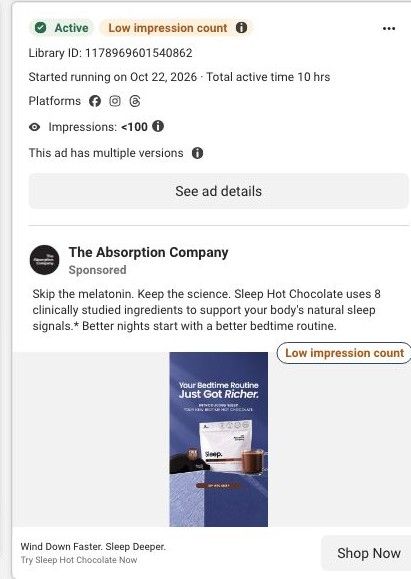
A static Meta launch ad for Sleep Hot Chocolate on a deep blue background, with the pouch and a mug under 'Your Bedtime Routine Just Got Richer.' and a small subline introducing it as a new bedtime hot chocolate. The copy leads with skipping melatonin and 8 clinically studied ingredients. It sends people to the Sleep product page.
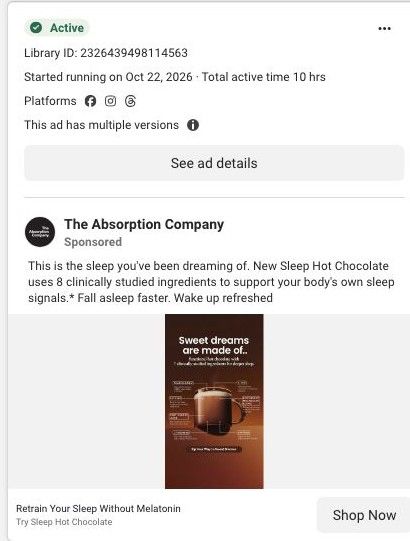
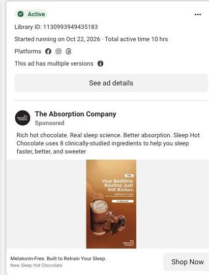
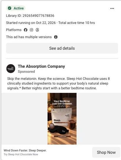
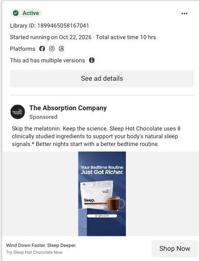
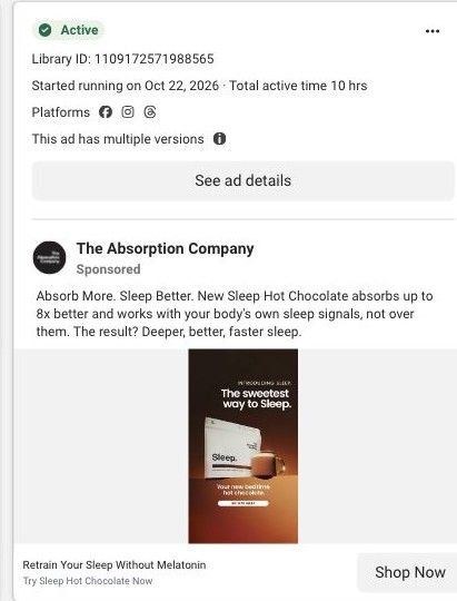
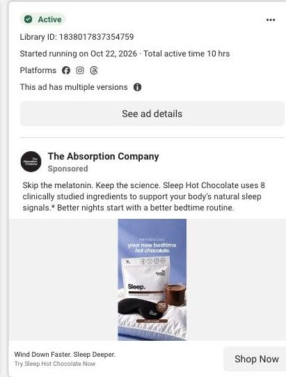
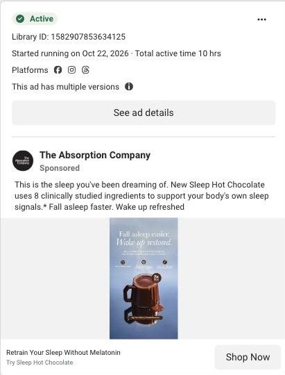
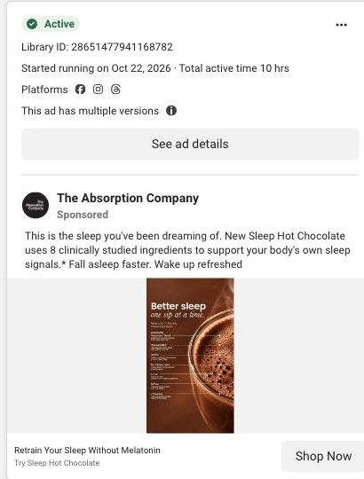
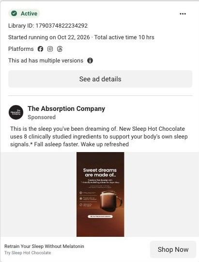
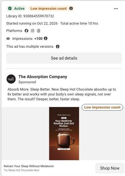
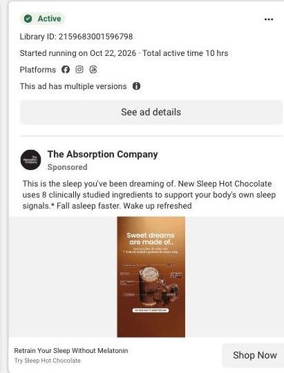
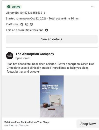
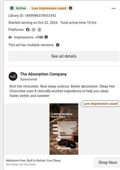
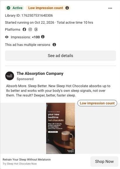
Active ad and exact outbound link observed in Meta Ad Library on October 22, 2026. This destination was captured with its public layout and styles on October 22. Offers and product selections may change. Selection reflects creative and page structure; performance is not available.

Wind Down Faster. Sleep Deeper.
Your Bedtime Routine Just Got Richer · launch bundle. A product gallery introduces Sleep alongside flavor and plan choices, gift details, benefits, a three-pathway explanation and a routine timeline. Compare the creative with the destination and explore the other ads sharing this route.
- Brand
- The Absorption Company
- Observed offer
- Wind Down Faster. Sleep Deeper.
- Creative angle
- Product launch
- Page type
- Product page
- Ad format
- Image
- Listed start date
- Oct 22, 2026
- Captured
- Oct 22, 2026
- Library ID
- 1178969601540862
- Destination
- absorbmore.com
Selected for its design and offer structure. Ad performance isn’t available in this collection.
What this ad does well
This is the blue Sleep layout with one addition, a subline under the headline that says what the product is, which fixes the biggest weakness of the plain version: a viewer now knows it's a new hot chocolate without reading the copy. The blue background still reads as nighttime, and the mug makes the format obvious. The copy's melatonin line speaks to people who've tried the usual option. Testing a subline while keeping everything else the same is a tidy way to learn whether clarity beats a cleaner layout.
What's missing
The subline explains what it is, but the ad still doesn't name the bad night it fixes or give a reason to try it now, and the subline type is small at feed size. If you make one like this, make the descriptive line larger and add the problem in a few words ('for nights your brain won't switch off'), plus the launch gift or a first-order price. A single early review line would give the launch the proof it lacks.
Beat by beat
- ImageThe Sleep pouch and a mug of hot chocolate on a deep blue background with a button at the bottom.
Blue sets the nighttime mood and the mug shows the format instantly.
- Headline'Your Bedtime Routine Just Got Richer' with a small subline introducing the new bedtime hot chocolate.
The subline tells new viewers what the product is without making them read the copy.
- CopySkip the melatonin, keep the science, then the copy's claim of 8 clinically studied ingredients.
It positions the product against the default sleep aid.
Where it sends people
The ad goes to the Sleep product page, a standard product page with the gallery and plan choices (3-month, 2-month and 1-month supplies, 2 weeks or buy once), a magnesium pairing, a three-pathway explanation, a wellness-over-time timeline, absorption figures and an experts section. The 'routine' framing matches the timeline, and the 2-week option gives a new buyer a small first step. The captured sections don't include customer reviews, which is the gap to fill for launch traffic. It's one of 17 ads in the library that land here.
The page it sends people to: How The Absorption Company launched Sleep with a gift-led product page
The Absorption Company's product page for Sleep, a melatonin-free drink mix launched in a new hot chocolate flavor. It offers bag or stick formats, flavor choices, five plan options with free gifts, a three-pathway explanation, an over-time section and absorption claims. 17 Absorption Company ads in the Fluid library link here, mostly launch statics about retraining sleep without melatonin.
How the page is built
- 01Gallery and claims
Shows the new hot chocolate bag with a frother and mask beside the rating and claimed sleep benefits, answering what this is and why it's new.
- 02Flavor, format and plans
Offers bag or sticks, two flavors and plans from three months down to buy once, with free gifts, answering what it costs and what to choose.
- 03Magnesium cross-sell
Suggests adding magnesium, answering what else to pair and raising order size.
- 04Why Sleep works better
Explains the brand's ingredient claims, answering why this over another sleep product.
- 05Three sleep pathways
Breaks the formula into calming, rebuilding the sleep signal and deeper sleep, answering how it's supposed to work.
- 06Over-time section
Describes what the brand says changes over time, answering when to expect anything.
- 07Absorption claims
Shows 5x and 8x absorption figures, answering whether the ingredients reach the body.
- 08Expert proof and pairings
Shows expert backing and complementary products, answering who vouches for it and what to add.
The first fixes we would make
- The page shows a star rating at the top, but there's no customer review section in what we captured. Add reviews near the plan picker, ideally ones that mention the flavors and the first week, so the launch has proof from buyers.
- Two formats, two flavors, five plan lengths and a flavor choice for each bag add up to a lot of decisions before add to cart. Preselect the recommended format, plan and flavor so a visitor can buy in one tap and adjust only if they want to.
Read the full breakdown of this page
Three hooks you could test
- Lead with the uncomfortable problem. “Brain won't switch off at night? Start with what's in your mug.”
- Call out the habit you're replacing. “Swap the late-night snack for a bedtime drink that's on your side.”
- Sell the outcome. “Your new routine: one mug, and asleep before you finish the chapter.”
What to borrow for your brand
- Add a short descriptive subline under a clever headline so new viewers know what the product is at a glance.
- Change one element at a time across versions (a subline, a color, a gift) so each test tells you something clear.
- Offer a small first size, like a 2-week option, and mention it in launch ads so trying something new feels low-risk.
One of 188 The Absorption Company ads in the Fluid Inspiration Library, captured from the Meta Ad Library on Oct 22, 2026. We record that an ad ran publicly, not how it performed.