Mary Welch Fox Design with The Absorption CompanySponsored
Esc
How The Absorption Company draws a PCOS before and after for berberine
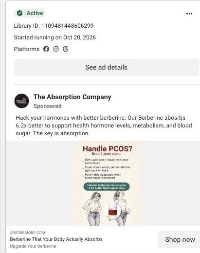
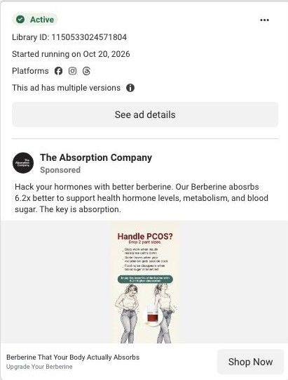
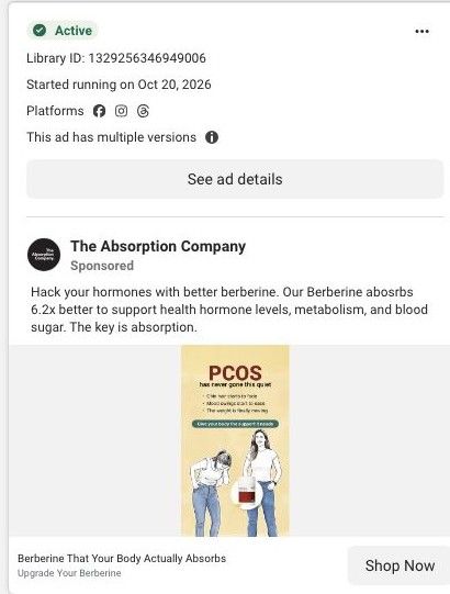
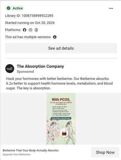
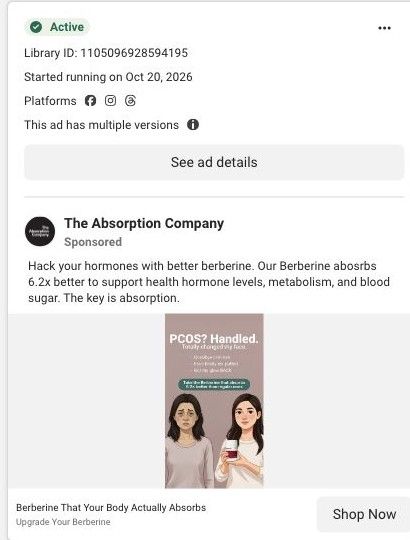
A static image ad for The Absorption Company's Berberine aimed at women with PCOS. Two pencil illustrations show a woman struggling to button her jeans and then holding loose jeans away from her waist, under a headline promising two pant sizes. Three lines explain the brand's reasoning. No offer. It links to the Berberine product page.
The Absorption Company
33 creatives lead here1 / 33
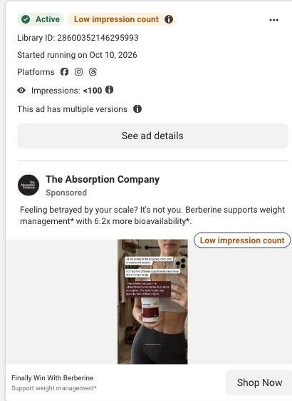
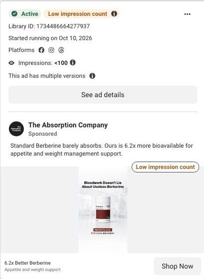
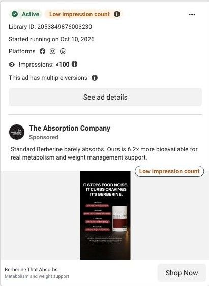
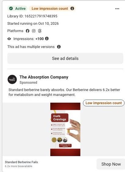
Berberine · product offer
Active ad and exact outbound link observed in Meta Ad Library on October 22, 2026. The page image and section source are the existing October 20 capture of this destination. Offers and product selections may change. Selection reflects creative and page structure; performance is not available.

Berberine That Your Body Actually Absorbs
Handle PCOS? · green illustrated checklist. The product gallery and subscription selector are followed by benefits, FAQs, complementary products, and proof sections. Compare the creative with the destination and explore the other ads sharing this route.
- Brand
- The Absorption Company
- Observed offer
- Berberine That Your Body Actually Absorbs
- Creative angle
- Audience-specific
- Page type
- Product page
- Ad format
- Image
- Listed start date
- Oct 20, 2026
- Captured
- Oct 22, 2026
- Library ID
- 1109481448606299
- Destination
- absorbmore.com
Selected for its design and offer structure. Ad performance isn’t available in this collection.
What this ad does well
The illustrated before and after is a picture people get in a second: tight jeans on the left, loose jeans on the right, the bottle in between. Drawing it instead of photographing it sidesteps the real-person before-and-after look while still showing the outcome. The three-line checklist explains the brand's argument in cause-and-effect pairs (diets work when insulin resistance calms down, and so on), which gives the viewer a mechanism instead of just a promise. A pill-shaped callout then makes the switch argument, claiming this berberine absorbs 6.2x better than regular ones.
What's missing
The headline, "Handle PCOS? Drop 2 pant sizes.", makes a specific body-change promise, and there's no source, disclaimer or attribution visible in the creative. That's the biggest risk in the ad, for trust as much as for review: a viewer with PCOS who has heard a lot of promises will want to know where that number came from. If you make one like this, keep the illustrated before and after but tie the headline to something you can support, and put a source or disclaimer line on the image. The copy also needs a proofread (absorbs is misspelled, and it says health hormone levels).
Beat by beat
- HeadlineAsks if you handle PCOS and promises dropping two pant sizes.
It calls out the audience and states the outcome in one line.
- ChecklistThree lines tie insulin resistance, metabolism and blood sugar to diets working, the scale moving and food noise disappearing.
It gives a cause-and-effect explanation, per the brand, so the promise has reasoning behind it.
- CalloutA green pill shape says to take the berberine that absorbs 6.2x better than regular ones.
It makes the switch argument against the berberine the viewer may already take.
- ImagePencil illustrations of a woman straining to button jeans, then holding loose jeans out, with the bottle between them.
The before and after reads in a second, without a word of copy.
- CopyTells you to hack your hormones with better berberine and says the key is absorption.
It repeats the absorption argument for anyone who reads past the image.
Where it sends people
The ad links to the Berberine product page, the basic product-page rung. The page moves from gallery and headline to 3-month, 2-month and 1-month supplies, then why the brand claims it works better, progress over time, expert backing, pairings and reviews. None of those section headings mention PCOS or the pant-size outcome the ad promised, so the viewer has to make that connection alone. The brand's focused best-berberine page, with its absorption explanation and switching section, would pick up the callout more closely. This page is the destination for 33 ads in the Fluid library.
The page it sends people to: Inside The Absorption Company's berberine product page and plan picker
The Absorption Company's standard berberine product page, with a gallery, a stat strip, a three-plan subscription picker with free gifts, benefits, an over-time section, expert proof, cross-sells and reviews. 33 Absorption Company ads in the Fluid library link here, mostly creator testimonial videos built on the 6.2x absorption headline.
How the page is built
- 01Gallery and title
Shows the bottle and breakdown images beside the product name and rating, answering what this is and whether people like it.
- 02Stat strip and claims
Lists the dose, absorption and GI-comfort claims in four tiles, answering why this berberine over another.
- 03Plan picker
Offers 3, 2 and 1 month supplies with savings, gifts and the guarantee, answering how much it costs and which option is the best value.
- 04Why it works better
Pairs a lifestyle photo with six benefit tiles and a customer quote, answering what the product is claimed to do.
- 05Over-time section
Lays out what the brand says changes over time, answering when someone should expect to notice anything.
- 06Expert proof
Shows expert backing, answering whether professionals vouch for it.
- 07Pairs Well With
Suggests complementary products, answering what else to add and raising order size.
- 08Customer reviews
Collects buyer reviews, answering what people like you say after trying it.
The first fixes we would make
- Creator testimonial videos send traffic here, but the page has no creator or video testimonial section, so the person who convinced the visitor disappears at the click. Add a strip of short creator clips (the WLP-1 page already has this format) right under the plan picker.
- Customer reviews sit at the very bottom. Pull three short reviews that speak to cravings and energy up beside the benefit tiles, so proof shows up while the visitor is still deciding.
Read the full breakdown of this page
Three hooks you could test
- Turn the benefit into a picture people get in a second. “Same jeans, two different mornings.”
- Lead with the uncomfortable problem. “Doing all the right things and nothing's moving?”
- Call out the habit you're replacing. “Another diet won't fix what's underneath it.”
What to borrow for your brand
- Use a drawn before and after instead of photos, so the outcome reads instantly without leaning on a real person's body.
- Write your benefits as cause-and-effect pairs (this happens when that changes), so the viewer gets your reasoning along with the promise.
- Put the switch argument in a high-contrast button shape in the middle of the image, so the comparison is the thing people remember.
One of 188 The Absorption Company ads in the Fluid Inspiration Library, captured from the Meta Ad Library on Oct 22, 2026. We record that an ad ran publicly, not how it performed.